Quantcast
Subscribe!


Enter your email address:

Delivered by FeedBurner


E-mail Steve
This form does not yet contain any fields.

    free counters

    Twitter Feed

    Entries in data (149)

    Wednesday
    Jun142017

    CHART OF THE DAY: The Aging Global Population

    I am just back from an extended trip that included stops in China for HR Tech China as well as Japan - two places, Japan in particular, who are dealing with the economic and social challenges of an aging population.

    Usually the 'aging' statistics of a country's people is represented by two statistics. One, the percentage of the population age 65 or older. And two, the ratio of people aged 18-64, (and expected, mostly, to be in the workforce), to people 65 and up, (who, mostly, are no longer in the workforce). This ratio is called the 'dependency ratio' and reflects about how many workers and contributors to a country's social insurance schemes are there for each possibly retired person, many of who need income support from these social programs. 

    Said differently, the higher the ratio, the more workers for each older person, the easier it is for a country to keep their social insurance programs funded and solvent.

    With all that said, I was thinking about this more lately after spending time in Japan, where this challenge is especially acute. But as the data below shows, this challenge of an aging population is more widespread than you might think - and, in time, will surface here in the US as well.

    Take a look at the data below on the dependency ratio worldwide, courtesy of Visual Capitalist, then some FREE comments from me after the chart:

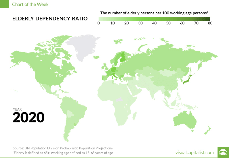
    While many countries face obstacles with aging populations, for some the problem is becoming severe.

    A dependency ratio below 5.0 is generally considered to be the mark by which a country has an 'aging' challenge. Countries like Japan, Italy, Germany, Canada, France, and the United Kingdom all fall below this level.  The United States sits in a slightly better situation with about 27.9% of its population expected to hit 65 or higher by the 2050 – and a dependency ratio of about 9, but in time the US (and the 2nd largest global economy, China), will both face looming demographic issues.

    What does this mean or suggest for organizations and for HR pros?

    Well, depending on the location, industry, and global nature of your business, chances are pretty good that the average age of the workforce is trending up. And it is also likely that since your competitors will be facing these same kinds of challenges that the competition for newer/younger workers to replace retirees or folks transitioningto fewer working hours will become more intense. Lastly, you may sooner than later be forced into thinking about and implementing changes to work practices, structures, and technologies that can better support an older workforce.

    It is an interesting time for sure. I am feeling a little older each day. Good to know it is not just me.

    Have a great day!

    Tuesday
    May302017

    CHART OF THE DAY: Which matters more, Google or Facebook?

    Apologies for not being more clear on the question in the post title, a better way to phrase it would be this:

    Which source send the most/best referral traffic to your online content - Google or Facebook?

    The answer, and the consultant in me loves this, is really 'It depends.'

    And what it depends on is the kind/type of content you are publishing, and is the subject of today's Chart of the Day.

    As always, and by popular demand, first the data, then some pithy, wise, and FREE comments from me:

    Here goes...

    Interesting, no?

    (Let's pretend it is interesting and proceed).

    1. I have to admit being a little surprised at the edge Facebook has over Google as a source of referral traffic for many of these categories. This surprise is driven and clouded by my own personal media consumption habits I guess. I would never imagine using or relying on Facebook as a source of information for anything other than family/close friend news. And I barely use it for that. Said differently, it is a good reminder that the way you/me consume content may not be the way most people consume content. I barely use Facebook, but I have to remember most of the rest of the world does.

    2. If you are pushing any kind of mainstream, general consumption type content, and you care about how many folks consume said content, you might need to think more about how you can up your presence/reach on Facebook, and maybe be a little less concerned about SEO, (which you never really understood anyway, but that is another story).

    3. BUT... Take a look at the last content category on the above chart - Job postings. In this category Google still dominates with 7x the referral traffic as Facebook. And it even dominates 'other' (sorry other). It seems like if you are in the Recruiting business you still do need to worry about SEO after all. And you probably need to get a handle of what Google is up to with its recent and early forays into the recruiting and job search space.

    This is totally fascinating data I think. And a reminder that job postings are not (yet) the same as the rest of the content on the internet. People look for them, and find them, much, much differently than many of the other forms of content that are all over your Facebook feed.

    Interesting stuff for sure.

    Have a great week!

    Monday
    May222017

    Learn a new word: The Optimal Stopping Problem

    I caught an interview over the weekend with one of the authors of Algorithms to Live By (can't recall which of the two co-authors I heard, but it doesn't matter. Kind of like it doesn't matter which of the two guys in Daft Punk plays a particular instrument on any given track. But that is another story.), and wanted to share a new word I learned from the interview that has some relevance to HR/Recruiting.

    For this installment of Learn a new word I submit The Optimal Stopping Problem.

    From our pals at Wikipedia:

    In mathematics, the theory of optimal stopping or early stopping is concerned with the problem of choosing a time to take a particular action, in order to maximise an expected reward or minimise an expected cost. Optimal stopping problems can be found in areas of statistics, economics, and mathematical finance (related to the pricing of American options). A key example of an optimal stopping problem is the secretary problem. Optimal stopping problems can often be written in the form of a Bellman equation, and are therefore often solved using dynamic programming.

    I bolded the 'secretary problem' which, despite its dated-sounding kind of name, is the example most commonly cited when discussing optimal stopping, and as luck would have it, is directly tied to HR/Recruiting.

    The secretary problem is essentially, the question of 'Given X number of job candidates for a given position, and also given you have to make a 'hire/decline' decision on each candidate before moving to the next one, how many candidates do you need to interview in order to maximize your probability of identifying the best candidate, while minimizing the risk of making a 'bad' hire, (say by waiting too long, rejecting too many candidates, and having to settle for a candidate that is left).

    Let's say you have 10 candidates for a position. You probably wouldn’t offer the job to the first candidate you interview, because you have no idea how that candidate compares to anyone else, or the general caliber of the candidates overall . But you probably don't want to wait until the 10th candidate, because if they’re the only one left you’re going to be forced to offer them the job (or keep it unfilled), regardless of how strong a candidate they are. Somewhere in the middle of the process there must be an ideal place to stop interviewing more candidates just to see what they’re like, and make a selection. But where to stop?

    Enter the Optimal Stopping Problem. You can dig into the math here, but it turns out there is an ideal place to stop interviewing candidates, (or dating different people in order to try and choose who to marry), and it's after you have interviewed (or dated), 37% of the contenders. After you get to 37%, make a note of the 'best' candidate you have seen so far, (let's call her Mary Jane). Then, continue interviewing candidates and when you find the first one that is 'better" than Mary Jane, stop all further interviews and immediately offer that person the job.

    How it works is related to the math behind estimating where the best candidate could be in the lineup. This number, expressed as 1/e, where 1/e eventually approaches 0.368, or about 37%. By analyzing the possible distribution of talent, it also turns out that if you interview the first 37 percent of candidates then pick the next one who is better than all the people you’ve interviewed so far, you have a 37 percent chance of getting the best candidate. 

    It's a really interesting way of looking at the hiring decision making process, (as well as other processes that involve trying to make the 'best' choice amongst a number of alternative). But it makes sense somehow, even if only on an anecdotal level.

    How many times have you slogged endlessly through an interview process where after some point candidate after candidate seem the same, and certainly no better than one you saw two weeks ago?

    Or how many of us have, (maybe even privately), thought about a past boyfriend or girlfriend that 'got away' and for some reason has never been eclipsed by the series of people that you have subsequently dated?

    Knowing when to stop, and understanding the probability that you have seen the best, or close enough to it, in any decision process is an enormously valuable thing.

    In the secretary problem, and in probably a bunch of other problems too, the answer seems pretty clear - once you hit 37% you have seen enough, you won't learn much if anything else useful, and you know how to make your decision.

    It is easy to apply in a job vacancy with 10 candidates. 

    It is a little tougher to estimate just how many people you are willing/able to date in order to know when to apply the 37% cutoff.

    Have a great week!

    Friday
    May052017

    CHART OF THE DAY: The Decline of the Landline

    Really interesting data from your pals at the National Center For Health Statistics on the long, slow but seemingly irreversible decline of the home landline phone. Turns out, if you have dropped your landline to go mobile only, you are not all that odd any longer.

    Here's the data and as you constantly demand, some FREE comments from me after the chart.

    Some really interesting data for sure. The key points or takeaways for me:

    1. More folks than not have ditched the home landline. Just over 50% of households are now mobile only. Pretty soon it will be kind of odd and weird to still have a landline. Additionally, more than 70 percent of adults between 25 and 34 were wireless only. 

    2. Being wireless only, as a majority of households are now, means, (as if you didn't know this), that our mobile phones are constantly powered on, are always within reach, and have become probably the most indispensable piece of technology we own. What could you go without with longer, your mobile phone or your car? Or your TV? Or your coffee maker? I might choose the coffee maker, but the car and the TV I would give up. Why not? I can request an Uber with my phone and stream the NBA playoffs on my phone. Once my phone can make coffee, well...

    3. Since the mobile phone is the most important piece of technology most of us use, then gaining 'share' of people's phpne time, no matter of you are in marketing, recruiting, sales, or even HR, is the most impactful thing you can do to advance your agenda. I would posit that at least half, if not more like 75%, of the efforts you are making to reach people should be focused on how you are reaching them on their mobiles. We all know this but when I see data about the usage and penetration rates of mobile technology for HR I am not so sure we are really applying what we know to be true. 

    Anyway, that's it for me. I'm out, have a great weekend!


    Monday
    Apr242017

    VIDEO: Take That For Data

    Yes, I know this is a few days old, and yes I know the 'Take That for Data' meme has probably already flamed out from your Twitter feed, but there still may be someone out there who missed Memphis Grizzlies coach David Fizdale's epic rant following a playoff loss to the San Antonio Spurs last week.

    Tiny bit of backstory to set this up.

    In the game of interest, (which the Spurs won), the Spurs were granted a massive advantage in free throw attempts - with one Spurs player Kawhi Leonard shooting 19 free throws himself, more than the entire Memphis team. After the game Coach Fizdale reflects on the loss, and the officiating in an already classic 2:45 minute rant.

    Check the video below, and make sure you make it to the end,  (email and RSS subscribers click through), then some comments from me about why this was a really interesting take, (that have nothing to do with basketball).


    Not one but two great meme lines in the rant!

    But the walk off line, 'Take That for Data' is the one that stuck with me. Mainly because in the same video where Fizdale asserts 'I'm not a numbers' guy, he proceeds to rattle off 12 different statistics from the game - data points that strengthen his argument that the game was poorly officiated and that disadvantaged his team.

    Why does this matter at all to anyone except hard core NBA fans?

    Because Fizdale in his little rant makes plain the challenge and the tension that often arises in organizations and with leaders when they are pressed to take a more data driven approach to business/HR/talent when they are not naturally inclined to do so.

    Don't tell me this is all about the data, then make decisions or drive toward outcomes that are incongruent with the data itself. 

    Or said differently, if you are going to be the hero in your organization that will push the 'data' agenda, then be prepared to have your data be called out and your conclusions challenged when others have a shot at interpreting the data as well.

    Take that for data.

    Have a great week!