Quantcast
Subscribe!


Enter your email address:

Delivered by FeedBurner


E-mail Steve
This form does not yet contain any fields.

    free counters

    Twitter Feed

    Entries in visual (4)

    Wednesday
    Mar052014

    Making sense of all that data

    Quick shot, or rather a question for a snowy Wednesday which is this:

    Just how are HR and talent leaders at organizations going to make sense of what is already the dramatic increase in workforce data from all the new and disparate sources that are now or will become available?

    If you think the answer is the deployment of more software tools for creating charts, dashboards, graphics, or better visualizations of that data you might be right. Or at least partly right.

    But it could be that you have already spent time and resources on these kinds of analytics tools and still find that there is a gap between the raw data and the insights you need to derive from that data. Maybe more charts and graphs are not the answer after all. Maybe charts and graphs are not enough.

    But a new company called Narrative Science offers a hint about what the next step might be in data analysis technology with a solution they call Quill.

    Quill is designed to examine raw data, apply complex artificial intelligence algorithms to the data, extract and organize key facts and insights from the data, and finally present that analyses of the data in a narrative, natural language format to the end user.

    So instead of looking at another bar chart with a trend line or a scatter plot that leaves your mind sort of scattered, the Quill system presents a key set of interpretations, conclusions and even talking points for the users (and communicators) of the data.

    Take a look at the video below from Narrative Science to see Quill in action, in the context of an investor's portfolio analysis, and think about how it seems reasonable or possible that a similar data analysis and narrative overlay could be done on all manner of HR, talent, and workforce data (Email and RSS subscribers will need to click through)

    Pretty cool, right? And likely not that terribly complex once some underlying assumptions are put down.

    The financial advisor gets the 'right' talking points and conclusions based on the data and the investor's profile and goals, then he/she can spend more time talking about their go-forward strategy and less time just trying to figure out what the data means. And the advisor can handle more clients too, which is certainly good for the investment firm's bottom line. Surely this has a parallel to the front-line supervisor in any field that has a dozen or more direct reports to keep on track on a daily, weekly, monthly basis.

    But this kind of narrative analysis cuts out one of the chief problems of trying to implement a more data-driven decision making environment, which is answering, simply, the question of 'Just what is all this data actually telling us?'

    I am not sure whether or not Narrative Science has HR or HCM data analysis capability on the product roadmap for Quill, but I bet even if they don't, we will see this kind of capability in the HCM space sooner or later.

    Or maybe some enterprising HCM solution provider is already doing this, and if so, I hope they submit their solution to the Awesome New Technologies for HR process for HR Tech in October!

    Friday
    Oct252013

    SPORTS WEEK #4 - Visualizing data - sports and otherwise

    Note to readers: As I have had a really busy Summer and early Fall preparing for the now recently concluded HR Technology Conference, the posting frequency here has been pretty diminished lately. Additionally, I find myself well behind my regular number of 'sports' posts that form the basis of my contribution to the annual 8 Man Rotation E-book on sports and HR. So I have declared this week of October 21 to be 'Sports Week' on the blog. I'm shooting for 5 days of sports-themed posts to make sure I don't get dropped from the 8 Man crew. So if sports takes are not your thing, check back in a week of so, when I will probably have another equally inane theme working.

    Onward..

    As I wrap up 'Sports Week' on the blog I figured for a Friday I would keep it simple take the easy way out and point your attention to the always interesting, frequently amazing Information is Beautiful site where the contenders for their annual Information is Beautiful awards are being featured.

    The awards are meant to showcase and honor excellence in data visualization, infographics, interactive data presentation, and tools with which to analyze and interpret data and information. And, as luck would have it, several of the submissions in the Data Visualization category have sports themes, as sports continues to be a ripe area for advanced data analysis, and for new ideas about how to examine and interpret existing data sets.

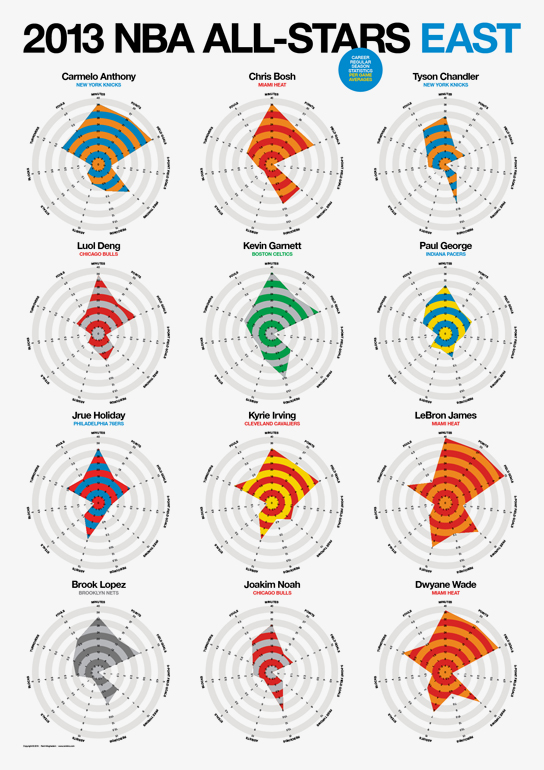
    The chart on the right side of this post, a graphic that presents some analysis and comparisons of the playing statistics of the 2013 NBA All-Stars naturally caught my attention, and there are similarly well-crafted and visually appealing submissions about soccer, bike racing, baseball, and more.

    But beyond the mundane world of sports, there are more serious and probably more important visualizations and tools that you should check out over on the Information is Beautiful site.

    With the seemingly endless amounts, types, and increased speed with which we are becoming inundated with data about our business, our workforces, our labor market and more, it has become more and more important that the ability to understand and present complex data in a relevant, meaningful, and accessible manner is a skill set any successful modern leader will need to possess.

    Sure, the charts and tools that are over at the Information is Beautiful site might be a little bit beyond your capabilities with design, and might be a little too much for the presentation of the more banal kinds of data we often deal with as HR and Talent pros, but there is certainly lots in terms of ideas and inspiration that anyone can take from such visually stunning displays.

    Ok, that's it, 'Sports Week' is wrapped, be sure to come back next week for an equally hard hitting series on the types and properties of the various Halloween candies and treats.

    Have a great weekend! 

    Tuesday
    May102011

    Brands, Red Gorillas, and Cold Rain

    The new website Brandtoys has introduced what they are claiming is the world's first visualization engine to assess and compare consumer sentiment and the online buzz of brands. The visualization takes the shape of a whimsical character whose physical attributes, (color, shape, size of ears, size of legs, and even surrounding climate), are determined by Brandtoys using source data from consumer surveys and from mining mentions of the brand on the social web.

    The idea being, for example, the more online chatter and buzz about a given brand, that brand's character will be portrayed with large ears; if the online sentiment surrounding a brand skews negative, (think BP), then it will be 'raining' on the brand's character.

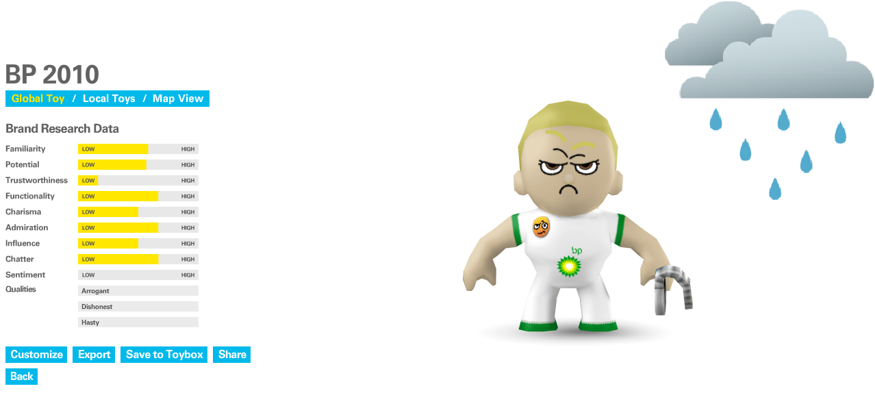
    To get a better idea of how this visualization works, take a look at the character for BP, pretty much a globally maligned brand stemming from 2010's Gulf Oil Spill and BP's subsequent handling of the crisis:


    Sort of what you'd expect - BP is characterized as a petulant, angry figure with an aggressive stance, and in the end appears totally unsympathetic or approachable. Persistent (and deserved) negative sentiment about BP produces the rain clouds above our little friend's head.

    Big deal, you may think, who needs a funny character to know that most people don't think all that highly of BP at the moment. But where the Brandtoys approach to the presentation of consumer and online sentiment data is more compelling is in the comparison of competing or adjacent brands (and their derived characters). Then the differences seem to be a bit more subtle and interesting.

    Have a look at the comparison of three similar brands - Miller Lite, Budweiser, and Heineken:


    While the character manifestations of each character are broadly similar, there are a few noticeable and striking differences, the Miller Lite character has much larger ears, signifying a high level of chatter and conversation about the brand; the Budweiser character's eyes are shut, indicating relatively low scores for brand 'charisma'. For a branding or marketing professional, 'seeing' these difference portrayed in this manner is got to be far more resonant than scanning a column of figures on a spreadsheet.

    But beyond being a cool, quirky, and kind of fun site to play around on (I dare you to not spend 5 or 10 minutes creating your own characters), the Brandtoys team emphasizes that the characters are backed by solid and ample hard data and analysis. The larger point to me, and why I decided to write about this site today, is that it reinforces the potential that we have in presenting data in new and innovative ways, ways that can help tell a story, that can enlighten and engage an audience, and are simply a heck of a lot more interesting than another spreadsheet or Powerpoint presentation.

    We have lots and lots of data. You business leaders are likely overwhelmed with the endless barrage of messages they receive each day. 

    What can you do to make your message and the information you are trying to communicate stand out?

    Maybe presenting your analysis with the assistance of a goofy red gorilla is not such a bad idea after all.


    Tuesday
    Jan042011

    The Long View

    Endless rivers of information race past us each day.  People, conversations, messages, calls, sports and news TV channels no longer content to simply 'present' the game or the top stories, but also have toImage - Hiroshi Sugimoto stream a unrelenting flow of information on other games being played and other stories that you may have missed.  As I write this I am watching a professional football game on TV, and in addition to the actual game coverage, the following supplementary information is super-imposed on the screen:

    1. The score of the current game
    2. The time remaining in the game
    3. The down number and number of yards to make to achieve a first down
    4. The name of the network broadcasting the game
    5. Computer generated lines showing the where each play begins and the yard to make to achieve a first down
    6. A constantly updating scroll of scores from all the other NFL games being played, also displaying the time remaining in each game
    7. A steady stream of graphics with statistical information such as the number of yards a given player has gained, or various individual and team accolades.
    8. Occasional graphics previewing upcoming shows on the broadcast network

    All that additional clutter information more or less adds to the overall presentation, increases (mostly) the viewers enjoyment of the game, and can benefit the broadcaster by keeping the viewer's attention for a longer period and decreasing the likelihood they will switch to another game or show. 

    But it is a ton of extra data to process, and while it does seem likely in this hyper-connected digital age that we are getting better as multi-tasking and complex processing, I wonder if we can at time miss the very nature of what we are trying to see and understand by keeping one eye always on what else is happening. 

    The image included in this post is taken from a collection by the photographer Hiroshi Sugimoto. The collection is called 'Theaters', and the photos were created by taking long-exposure photographs of cinema screens for the entire duration of a movie, resulting in a blank white screen, that varies in brightness and intensity according to the overall mood of the film.  If the movie was light, and happy; a brighter screen emerged, dark or horror movies resulted in a much more subdued and drab screen.

    Certainly the images created by Sugimoto don't tell us much about the original film from which they were based. The screen in the photograph is essentially blank, the only piece of information we can deduce is the relative mood of the piece (maybe), by comparing the brightness across a set of images from many films.

    But in a way perhaps these images, while not being a good substitute for the original film presentation do offer an important and possibly compelling complement.  While we watch a film, especially a modern one full of fancy computer generated effects, it can be very easy to become enthralled by these effects, by the fast flowing stream of characters, settings, action scenes, music etc.  We can often leave a movie thinking more about individual or isolated elements of the presentation, sometimes missing the larger message (if there is one), or redeeming or lasting lesson.

    I think there may be a case, whether it is watching a sports broadcast on TV, catching a movie in a theater, assessing and interpreting the news of the day, and certainly making sense of the incredible volumes of data, links, updates and other by-products of this connected world that more than ever the need to step back, open the camera shutter, and observe long enough to get a better sense of the big picture will be an important and vital skill.

    What do you think? Are we losing focus in the barrage of information?