Quantcast
Subscribe!


Enter your email address:

Delivered by FeedBurner


E-mail Steve
This form does not yet contain any fields.

    free counters

    Twitter Feed

    Entries in workforce (77)

    Friday
    Dec262014

    REPRISE: I don't see him like a robot. I see him like a person.

    Note: The blog is taking some well-deserved rest for the next few days (that is code for I am pretty much out of decent ideas, and I doubt most folks are spending their holidays reading blogs anyway), and will be re-running some of best, or at least most interesting posts from 2014. Maybe you missed these the first time around or maybe you didn't really miss them, but either way they are presented for your consideration. Thanks to everyone who stopped by in 2014!

    The below post first ran back in January and is a good example of a theme I seemed to keep coming back to throughout the year, actually for the last few years - the workforce impact of more powerful and sophisticated automation technologies like Baxter the Robot . 

    Have a great weekend!

    ----------------------------------------------------------------------------------

    I don't see him like a robot. I see him like a person.

    A couple of years ago when I know I was one of the few folks in the space regularly writing about robots at work and the potential impacts that were going to be realized from these developments, I used to get a boatload of Google search traffic simply from keyword searches on the word 'robot'. These days, I see much less of that kind of search directed traffic, even though I am probably writing even more frequently about the topic. 

    But lately it seems like everyone in the HR/work/workplace blogosphere is talking, writing, and speculating about robots and the increasing automation of all kinds of work. While I do think that this increase and almost mainstreaming of attention on the topic is really quite needed, I also think that at some level we might be already getting a little tired of the topic, and are even beginning to tune out these messages.

    So rather than run the latest piece about the newest advancement or application of robot or otherwise machine intelligence to a new form of work and issue off another warning about how you or your kids need to take this all very seriously as one day the robots will take all our jobs and leave us, well, trying to figure out what to do with ourselves, I decided to share a simple, short video about a specific application of new robot technology in the workplace, and let you decide what it might mean.

    Embedded below, (email and RSS subscribers will need to click through), is a recent video from Rethink Robotics, the makers of the pretty amazing industrial robot known as Baxter. Baxter, you might have heard, represents an improvement to traditional stationary and bespoke, single-use manufacturing robots of the past. Baxter is flexible, can be easily programmed, and can work in very close proximity to people.

    Check the video and pay particular attention to the comments of one of the plastics plant supervisors, a Ms. Martinez about what it is like working with (and supervising as it were) Baxter:

    Really interesting, for a couple of reasons I think. Certainly the big, easy to remember line is when Ms. Martinez admits to 'seeing' Baxter like a person, like the person who would have previously had that job on the line that Baxter is now cheerfully, ceaselessly, performing. But we also hear some comments from the plastic factory leadership about how the cost savings and efficiency gains from automation are necessary to save jobs in the aggregate, even if the shift to Baxter(s) will cost at least some jobs in the process.

    No matter if you take the 'robot threat' seriously, or think it all a bit silly, I think it does help to ground the conversation at least a little bit sometimes, and the experiences and observations of front line organizations, managers, and co-workers that are now, increasingly, co-existing with more and more advanced robotics are worth considering.

    Thursday
    Dec182014

    The disconnect between the skills that get you hired and the jobs most workers have

    Wow, that was a long post title. Sorry. The post won't be that long at all, trust me.

    All I want you to do is look at two charts and then draw your own conclusions about the significance, if any.

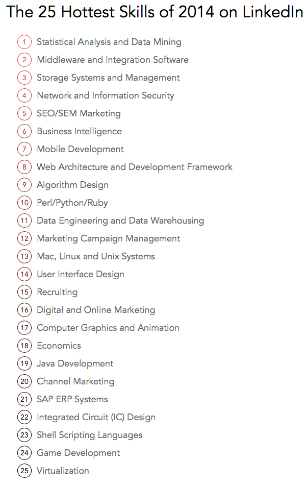
    The first, courtesy of the world's largest professional network, LinkedIn, who published some data they call 'The 25 Hottest Skills That Got People Hired in 2014', (from an analysis of member skills, employment changes, and recruiter interest on LinkedIn). 

    Here is the chart:

    Now for the second chart I'd like to bring to your attention, from the Bureau of Labor Statistics a look at the Top 10 occupations with the highest employment (dated from May 2013, so it is slightly older than the LinkedIn data, but it was the latest I could find after about 5 minutes of exhaustive research)

    Here goes:

    See any differences between what gets people hired, at least people on LinkedIn, and the kinds of jobs that are held by the largest numbers of people in the USA? These Top 10 occupations make up about 22% of overall US employment, in case you were wondering.

    Wonder how far down on the BLS list (and you can check the full list of occupations as defined by the BLS here), you have to go before you run in to 'Statistical Analysis and Data Mining', the top 'hot' skill for 2014 as per LinkedIn. I will save you a click and let you know that all the occupations that the BLS rolls up into 'Computer and Mathematical Operations', (where most of LinkedIn's Top Hot skills would likely map), account for about 3.7M workers, that is just under 3% of all the jobs in the country.

    Ok, since I said I was going to just show the charts and leave it up to you to think about, I better shut up.

    Have a fantastic day. And don't spend so much time on LinkedIn.

    Tuesday
    Dec092014

    ECON 101: On high, low, and middle-skilled workers

    There is a great analysis on how workers holding jobs in different skill levels, (high, middle, and low) over at the Federal Reserve of Atlanta site that if you are as much of a labor market/macro workforce data geek as I am, I highly recommend reading.

    The question the researchers set out to answer was based in this: We know that from a combination of the most recent economic recession and augmented by persistently advancing automation technology, that so-called 'middle' skilled workers were the most hard-hit group in the last downturn and recovery. What the researchers wanted to understand is what has or is happening to these displaced middle skill workers. Were they still out of work? Were they forced into lower skilled or service-type jobs? Or did they get the opportunity to move into more highly-skilled (and better paying) jobs?

    Note - for the purposes of this analysis, 'middle-skilled' cconsists of office and administrative occupations; sales jobs; operators, fabricators, and laborers; and production, craft, and repair personnel (many of whom work in the manufacturing industry).

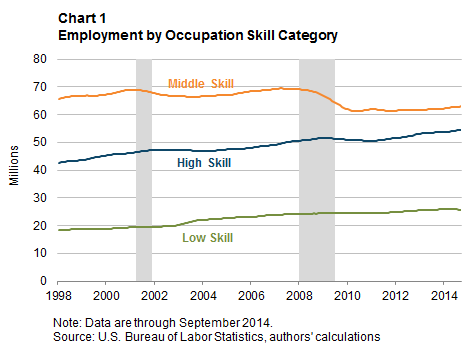
    So let's take a look at the data - first the aggregate employment levels since 1998 for each skill category:

    As of September 2014, the middle-skill employment level was still about 9 percent below the (pre-recession) 2007 level. In contrast, employment in low-skill occupations is 7 percent above pre-recession levels, and employment in high-skill occupations is about 8 percent higher than before the recession took hold. So the first assumption, that middle-skilled workers were hit harder by the recession/recovery than workers in the low and high skilled groups seems to have held up.

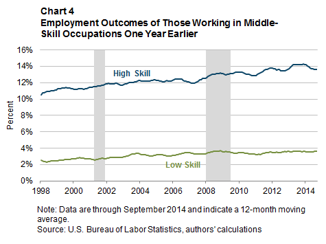
    But what has been happening to these displaced middle-skilled workers? Surprisingly, many of them are/have moved into the high-skilled classification. About 83% of the displaced middle-skilled workers that are back employed are still in middle-skilled roles. But what about the other 17% of workers?

    Let's take a look at the data:

    The data shows that about 13% of the group has transitioned from a middle-skilled job into a high-skilled one. Only about 3.5% have been driven into a low-skilled role. This may seem like a small percentage of upward mobility, but it still seems significant to note.

    If, as many economists expect, there continues to be further pressure and erosion of middle-skilled workers (which if you take another look at the first chart you will see still make up the largest category), it is important to the overall economy what happens to displaced middle-skilled workers. If they can transition into high-skilled roles, they see on average a 27% increase in compensation, as opposed to a 24% drop if they move into low-skilled roles.

    While this data and these figures seem all kind of abstract and distant, then think about them this way: Think about your life and lifestyle with a 27% raise in compensation. Then think about it with a 24% pay cut. Pretty big difference, right?

    And then take those scenarios, multiply them by 10 million or so, and now you have some feel for how important this issue is for the US economy.

    Monday
    Nov242014

    REVISITED: For American workers, the quits keep coming

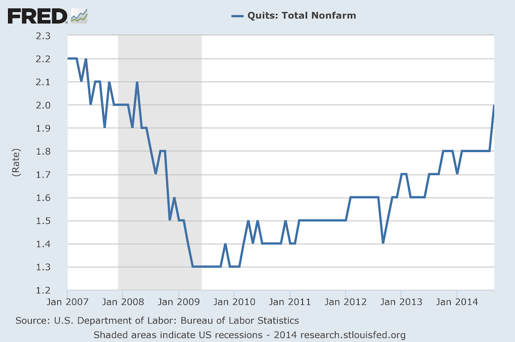
    Back in February I posted CHART OF THE DAY: The Return of the Quit, a look at the increasing rate of 'quits', (HR nerds can call them 'voluntary separations' if that makes you feel better), across the American labor market.

    Back in February, the news was that quits were rising from the financial recession low point of 2009-2010, reflecting growing individual confidence in the labor market and consequently placing pressure on organizations to develop retention, replacement, succession planning strategies.

    Fast forward about nine months to the latest data on quits, (Note: this data comes from the Bureau of Labor Statistics JOLTS (Job Openings and Labor Turnover Survey) report), and the story about quits continues to play out along the same lines as I talked about in February. 

    I'm going to hit you with the updated data below, then revisit my (FREE) commentary after the jump. I actually think all the points I made about th February data still apply in November, the question really being if we as organizational talent pros are paying enough attention to this data.

    Here is the latest data, showing the Quit rate climbing to about 2%:

    Some thoughts:

    1. 'Quits' are a function of several factors, (personal circumstances, the magnitude of the jerkitude of your managers, people self-selecting out as not being in the right job, etc.), but most observers of the Quit rate on a macro level ascribe movements in the rate to worker's confidence in their ability to find another, and what they think will be a likely 'better', job.  The rate moving up, to a level that is approaching the pre-recession level, is a signal that overall job market confidence is rising.

    2. So while you and many other HR/Talent pros are lamenting about 'hard-to-fill' jobs, simultaneously more of the workforce are thinking of themselves as 'easy-to-place'. I'm not sure how that apparent paradox will work out, (probably very differently depending on location, skills, etc.), but it is kind of interesting and amusing at the same time.

    3. How you are thinking about and reacting to news of a good employee quitting is probably changing too. In 2008 or 2009, you might have reacted by thinking, 'What is she crazy? Where is she going to find another job with as good pay/benefits/cupcake Friday like we have here?'. Now? Probably you'd think more along the lines of 'Hmm... She's going to XYZ Corp? I wonder if she could bring me over there too.'

    4. Last, while the Quit rate increasing kind of feels like it is a good thing, there is certainly some warning signs as well. For one, those recent quitters might find that their skills and experience are not in as high a demand as they figured, and thus end up spiking the unemployment rate in the short term, (as well as having to take a boatload of grief from people questioning their sanity for quitting a perfectly good job). They might find, even today, that keeping a job is much easier than finding a job. And increasing worker confidence might put pressure on companies to increase wages, which can also have a detrimental effect on growth and profits.

    So take a look at the JOLTS report if you are interested in this kind of data, I think it gives a little more color and depth to the more widely reported headline of the total rate of unemployment.

    Are you seeing an increase in 'quits' in your shop?

    Ready to quit yourself?

    Have a great week!

    Thursday
    Oct232014

    CHART OF THE DAY: Everything you want to know about Labor Force Participation

    I know that I definitely have hit Labor Force Participation a few times in the past in the often imitated but never exceeded CHART OF THE DAY series here on the blog, but now thanks to some really excellent work out of the Federal Reserve Bank of Atlanta I think we have the best source yet for digging into Labor Force Participation.

    From the Fed Atlanta's Labor Force Participation Dynamics micro-site, check out just a couple of examples of what the data shows with respect to Labor Force Participation, that encompasses some important measures of who is actually working, looking for work, or unable to find work from the labor force.

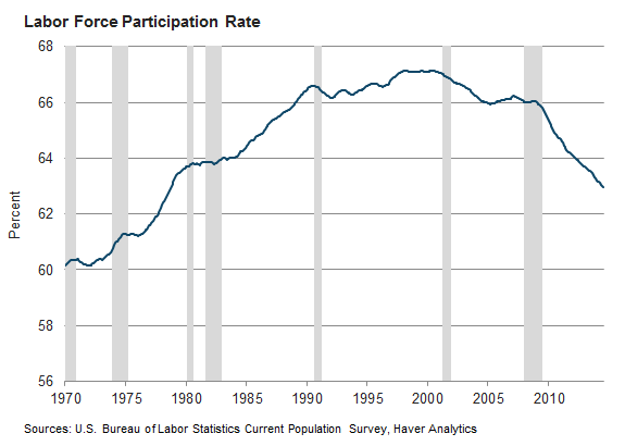
    Chart 1 - The Big Picture - By mid-2014 Labor Force Participation was at its lowest rate since 1978

    Chart 2 - What accounts for this steep decline since the start of the financial crisis and ensuing recession in about 2007? Well, lot's of things, but mostly it is just the population getting older.

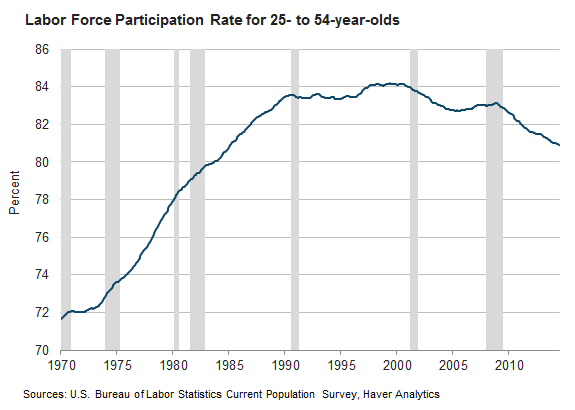
    Chart 3 - But what about people in their 'prime' working years? Are they still in the Labor Force in the same proportions history would suggest? Turns out not really.

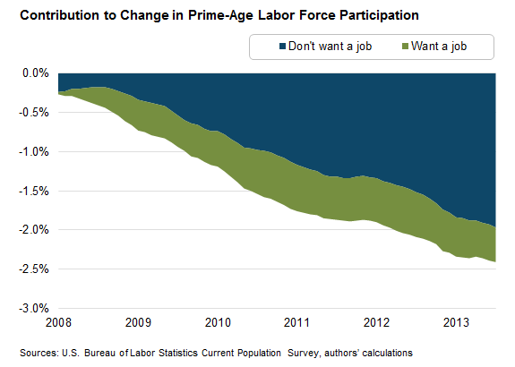
    Chart 4 - But most of the decline in Participation for 'prime' workers has to be the bad economy, right? Most of the folks in the 25-54 group that are not in the labor force are missing not by choice I bet. They are probably just frustrated but still want to work. Actually, no.

    Turns out that the decrease in labor force participation among prime-age individuals has been driven mostly by the share who say they currently don’t want a job. 

    I know that it can be really hard to see the link from this kind of macro labor force data and the trends in participation to your day-to-day or even year-to-year workforce planning and talent management initiatives. But I am convinced it is important for any business leader to be at least cognizant of the macro trends and dynamics that your organization and your current and future labor force operate in. Plus, charts are fun!

    But ok, enough charts for now, you can check out the Fed Atlanta's Labor Force Participation Dynamics site for even more data and analysis on this topic. 

    Have a great Thursday!