Quantcast
Subscribe!


Enter your email address:

Delivered by FeedBurner


E-mail Steve
This form does not yet contain any fields.

    free counters

    Twitter Feed

    Entries in data (149)

    Friday
    Mar182016

    CHART OF THE DAY: The End of Soda (or Pop, if that's how you roll)

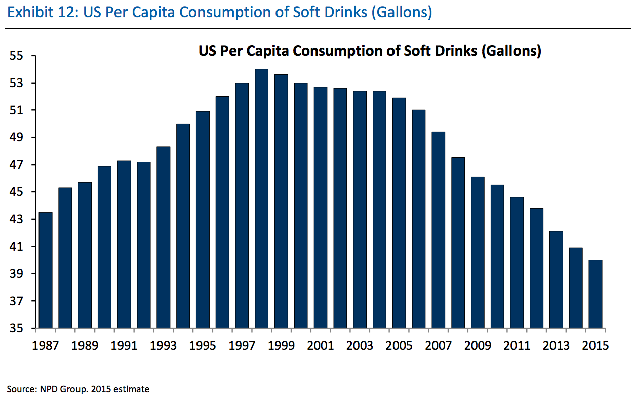
    Quick shot for a busy Friday, today's chart is from our pals at Business Insider and shows what BI calls an 'epic' (I'd say it is more 'moderate') decline in per capita soda (or pop) consumption in the USA over the last 18 years.

    Here is the chart, and after that, as always, some FREE commentary from me after the data:

    The headline number is that per capita soft drink consumption has declined from a peak of 53 gallons in 1997 all the way down to 40 gallons in 2015. So just about a 25% decline. Still 41 gallons is a lot of soda, (observed as I down my second Diet Dr. Pepper of the day).

    Why is this important? I am note sure it is, but to me it is at least interesting.

    Could it be, at least by this one measure, the public is finally getting more concerned about the ill effects of the consumption of empty calories from sugary drinks? Or maybe the focus on employee wellness and well-being by lots and lots of organizations is having a positive impact on people's habits with respect to soft drink consumption? Perhaps it's a generational thing. Do 14 year olds like to drink Coke or Mt. Dew?

    Of could it be a simple lack of innovation by the soft drink makers themselves? After all, while we love and praise innovative companies, the second that Coke or Pepsi messes about with the formula or our favorite drink the backlash is immediate and the outrage is enormous.

    Who knows for sure? But as an observer of the world, I find it interesting for sure. Perhaps you do as well.

    Have a great weekend!


    Tuesday
    Mar012016

    CHART OF THE DAY: How large is the 'gig' economy?

    In my 'What HR should and should not be talking about in 2016' piece from early January I had the 'gig' economy listed as one topics that we collectively needed to stop talking and thinking so much about this year. By way of refresher (mostly for me), here is what I said in January about the 'gig' economy:

    "The 'Gig' Economy - Here's the thing about the rise in importance of the so-called 'Gig Economy', it is quite possible that its growth as a percentage of the labor force has been generally exaggerated possibly due to the oversized coverage that the largest Gig company, Uber, has received over the years. According to this Wall St. Journal piece from last July:

    Far from turning into a nation of gig workers, Americans are becoming slightly less likely to be self-employed, and less prone to hold multiple jobs. Official government data shows around 95% of those who report having jobs are accounted for on the formal payroll of U.S. employers, little changed from a decade ago.

    If Uber and its ilk were fundamentally undermining the relationship workers have with employers, that shift would be showing up in at least some of the key economic indicators. Hundreds of thousands of Americans, or even a few million, may have dabbled in the gig economy, but in the context of the 157 million-strong U.S. labor force, the trend remains marginal.

    It is possible that since there are likely more 'Gig' workers in coastal 'elite' cities like New York and San Francisco, and folks in these cities dominate the conversations in the media, that it just feels like the Gig economy is fast becoming the dominant form of work. But the data just doesn't reflect that, at least not yet. And it likely will not in 2016 or in 2018 or maybe even in 2020. So for now, it makes sense to think about your labor force composition, sure, (just like it always has), but massive, fundamental changes in that mix of labor is not typically top of mind for most organizations."

    So that was my take in January and two months later I have not really seen much if anything to make me think any differently about how important/influential the 'gig' economy really is to the vast majority of workers, organizations, and HR leaders. Today's CHART OF THE DAY courtesy of the JPMorgan Chase research folks seems to back that conclusion up.

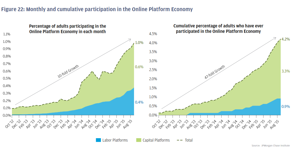
    Taken from a three-year study of over 1 million JPMorgan Chase customers, the survey titled 'Paychecks, Paydays, and the Online Platform Economy' attempted (among other things) to get a better understanding over a three-year period just how important the 'gig' economy was/is in terms of worker participation levels and contribution to overall individual income. The entire report is interesting, but the chart I want to share is below, on the overall participation rates in 'gig' work. Here is the data, and the as you demand, some FREE comments from me:

    Apologies if some of the figures on the charts are a little tough to read, so I will just repeat the headline numbers - in Sept. 2015 the final month of the study, about 1% of individuals earned income from the 'gig' economy. In the second chart we see that in the 3-years of data up to Sept 2015, that about 4% of individuals had at any time earned income from the 'gig' economy.

    So 1% of JPM's surveyed customers were active on Uber, AirBnb, EBay ,and the like in Sept 2015 and 4% of people overall at some time earned some income from working (or selling things), on one of these platforms.

    While both figures represent significant growth in the reporting period, both were growing from incredibly small starting points. The truth is that the vast majority of people are not participating in these platforms and the ones that are, (another major section of the survey data), are using it as a supplement to more 'regular' forms of income, i.e. 'normal' jobs. Said differently, the chances are the only Uber drivers you have ever met are the ones that have driven you somewhere.

    To get back to my original point from January, while we read lots and lots about the 'gig' economy, its actual impact and influence on most worker's lives is not all that significant, at least not yet. If you are at all interested in this kind of data, I encourage you to check out the full JPMorgan Chase study here.

    Tuesday
    Feb232016

    What can we prove?

    Over the weekend I went all 'Back in the day' with my 'Generation X movies, ranked' post, but something I heard today made me compelled to fire up the way back machine once again. 

    The backstory....

    Sitting on a (delayed) plane waiting to get clearance to take off last night and I could not help but overhear the dude next to me carry on a 'You were supposed to turn off your cell 10 minutes ago but obviously you are too important to follow the rules' conversation with what I think must have been his colleague at whatever monkey business they were up to.

    My pal in seat 4A kept repeating the following questions to the person on the other end of the conversation, (who I have to think was probably praying for merciful death, or a fire drill):

    "Do we know that for sure? Can we prove it?"

    So to tie this back to the 'In the day' reference at the top, the (interminable) conversation reminded me of one of my favorite films that I probably could have included on the 'Gen X' list, 'And the Band Played On', an HBO film from 1993 about the discovery of the AIDS virus and the political and medical flights that were hallmarks of the earliest efforts to combat the disease. 

    In the film, the doctors and the medical researchers of the CDC are featured prominently - the agency was at the time at the forefront for governmental efforts towards the identification of the virus, understanding its effects, and finally, attempting to identify the best approaches to keeping the virus from spreading. Throughout the film, the CDC researchers and doctors would develop theories about the disease and make (educated) guesses as to what the government and public health officials should be doing to try and stem the danger to the public.

    But every time one of the doctors shared his or her theories about what was happening the head of the CDC would respond with the following series of questions, or challenges:

    What do we think?

    What do we know?

    What can we prove?

    The motivation behind the CDC head's questions was that the suits in charge would not authorize additional funding for testing and research unless the doctors had a way to prove that their theories about how the disease was being spread and the needed actions to take were accurate. 

    Bottom line: It doesn't matter what we think. It even doesn't matter what we know. It only matters what we can prove.

    And I think these three simple questions are good ones to keep in mind for HR/Talent pros who are seeking to adopt more data-driven approaches and analyses to their practices of recruiting, development, retention, and succession planning, (and maybe more). 

    It is a good reminder because like the CDC head in the movie, the execs that control the budget and the strategic direction for all HR programs are more likely to back ones that are more about what can be proved, and less about ones that are about what some HR person thinks.

    What do we think?

    What do we know?

    What can we prove?

    A solid set of questions to use as you frame up your data driven HR projects.


    Wednesday
    Feb032016

    Learn a new word: Goodwill Impairment

    If you follow the tech and finance news at all, you will no doubt be familiar with the recent and ongoing troubles and challenges being experienced at Yahoo.  

    Yesterday the 'old school' internet company announced some strategic shifts, including the plans to reduce its workforce by 15% in the coming months, resulting in an employment count of about 9,000 -  42% below the level in 2010.

    Part of the earnings announcements included this statement, about on-paper losses totaling about $4.4B due to an accounting exercise known as 'Goodwill Impairment'. Here is the language from Yahoo, then we'll break it down a little, because well, that's what we do here on the blog:

    We concluded that the carrying value of our U.S. & Canada, Europe, Latin America and Tumblr reporting units exceeded their respective estimated fair values. The goodwill impairment resulted from a combination of factors, including decreases in our market capitalization, projected operating results and estimated future cash flows.

    Seems kind of boring, almost normal accounting-speak right? Let's look at the definition of a 'Goodwill Impairment', courtesy of our pals at Investopedia:

    Goodwill that has become or is considered to be of lower value than at the time or purchase. From an accounting perspective, when the carrying value of the goodwill exceeds the fair value, then it is considered to be impaired. Negative publicity about a firm can create goodwill impairment, as can the reduction of brand-name recognition.

    And in the notes about the accounting requirements related to Goodwill Impairment for companies, Investopedia says this:

    Generally accepted accounting principles, (GAAP), require businesses that have the type of assets that might be impaired to make periodic tests to see if those assets are, in fact, impaired.

    So the accounting rules require if your business has a potentially 'impaired' asset like Yahoo's $1.1B Tumblr division, that you must from time to time evaluate (and likely have audited), the 'true' value of the asset. And in the case of Tumblr, it turns out that it really isn't worth $1.1B and the true value is something like $300M, then you have to take a charge for the difference, ($800M), in the financial statements. And that stings investors a little bit. Ok, maybe a lot.

    Why the mini-accounting lesson?

    Because the periodic review, valuation, and write-down of financial assets in the accounting sense is probably an exercise we can and should apply to all kinds of projects, technologies, programs, even personal relationships. 

    Does that 'progressive' and high-tech performance management system and process you implemented in 2012 still have value today? Or does it need some kind of 'impairment' write-down as well?

    Does the new employee orientation guide that you spent big bucks developing and printing up in 2010 still have relevance today, in light of all the changes in business, technology, employee expectations, and more?

    Does your 'best work friend' that you have had since 2008 remain the 'right' person for you to pal around with, or are they kind of holding you back at the office?

    As Yahoo's experience with it's Tumblr acquisition remind us, things can change really, really fast. And an asset that was worth $1.1B just a couple of years ago suddenly is worth less than half that amount today. But the 'Goodwill Impairment' while painful, at least provides financial types a mechanism to recognize these changes, attempt to make them right on the financial statements, and give leaders a chance to move forward from a new starting place. And when times are bad, that at least offers a little bit of hope moving forward.

    If you could take a 'Goodwill Impairment' charge in your business or life today, what would it be?

    Tuesday
    Jan052016

    CHART OF THE DAY: Is it a good time to find a quality job?

    Guess what? CHART OF THE DAY is back for another year of stats, data, and information about work, labor markets, demographics, basketball, and Tom Cruise movies. 

    For new blog readers, here is a quick reminder of how CHART OF THE DAY works. First, I find what I think is an interesting chart, graph, Venn diagram, or my favorite an exploding Pie chart that helps visualize some data set I find intriguing. I re-publish the chart here with a link back to the original source. Last, I toss out 2 or 3 thoughts on the data's significance or relevance for those of us in the HR, talent, technology, workplace spaces.

    Got it? Okay, here goes...

    For 2016's first submission courtesy of Business Insider and Gallup, a look at what American's think about the question "Is it a good time or a bad time to find a quality job?"

    Some quick thoughts about the data:

    1. Gallup has been asking this question in their surveys since 2001, and the latest data from 2015 that shows the percentage of Americans that feel it is a good time to find a quality job sits at 42%, which is just a shade under the series' all-time high of 43% from 2007. Said a little differently, since 2001, according to this survey American's attitudes about the job market conditions have NEVER been more optimistic.

    2. Gallup didn't specifically survey people 'actively' looking for work, so we can assume the increased confidence in the labor market is a reflection of the broader population's attitudes. That means just about everyone is feeling if not good, at least relatively better about labor market conditions. Which translates to the likelihood of increased turnover, even for those employees that you thought were 'safe', i.e., not likely to seek opportunities elsewhere. Will 2016 be the year that more people seek greener grass elsewhere? Maybe so.

    3. The recent HR technology trend towards developing 'predictive' models for providing insights into things like attrition and retention can provide tools that can possibly help HR leaders in this area. But the key question I would ask my HR technology provider of such predictive tools is the extent to which, if at all, these tools take into account these external trends in worker attitudes. Does the tool adapt to reflect the macro-trends and environmental conditions that exist and impact organizations? Or will your 'predictive' tool really act like more of a 'reactive' tool, failing to adapt quickly enough to changing market conditions? Good questions to ask. 

    Ok that's it, I'm out.

    Happy Tuesday!