Quantcast
Subscribe!


Enter your email address:

Delivered by FeedBurner


E-mail Steve
This form does not yet contain any fields.

    free counters

    Twitter Feed

    Entries in labor (76)

    Thursday
    Jan012015

    REPRISE: Whose Labor Market is it Anyway?

    Note: The blog is taking some well-deserved rest for the Holidays (that is code for I am pretty much out of decent ideas, and I doubt most folks are spending their holidays reading blogs anyway), and will be re-running some of best, or at least most interesting posts from 2014. Maybe you missed these the first time around or maybe you didn't really miss them, but either way they are presented for your consideration. Thanks to everyone who stopped by in 2014!

    The below post first ran back in July as a part of the CHART OF THE DAY series and was a great example (in convenient chart form) on a subject I hit quite a few times in 2014 - the tightening labor market and its impacts and talent and work. Long story short: In 2014 the candidates strengthened their control of the market and HR/Talent pros can't ignore that fact any longer.

    Happy 2015.

    ----------------------------------------------------------------------------------

    Whose Labor Market is it Anyway?

    There is a simple answer to that question, really. 

    The candidates run the current labor market, at least for large, (and growing) swath of managerial, professional, and technical roles. 

    Check out this week's Chart of the Day, a look at how recruiters see the labor market - candidate driven or employer driven,  courtesy of the MRI Network's latest recruiter sentiment study, (as always, some pithy commentary from me after the chart)

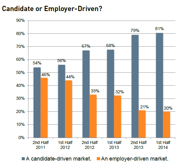
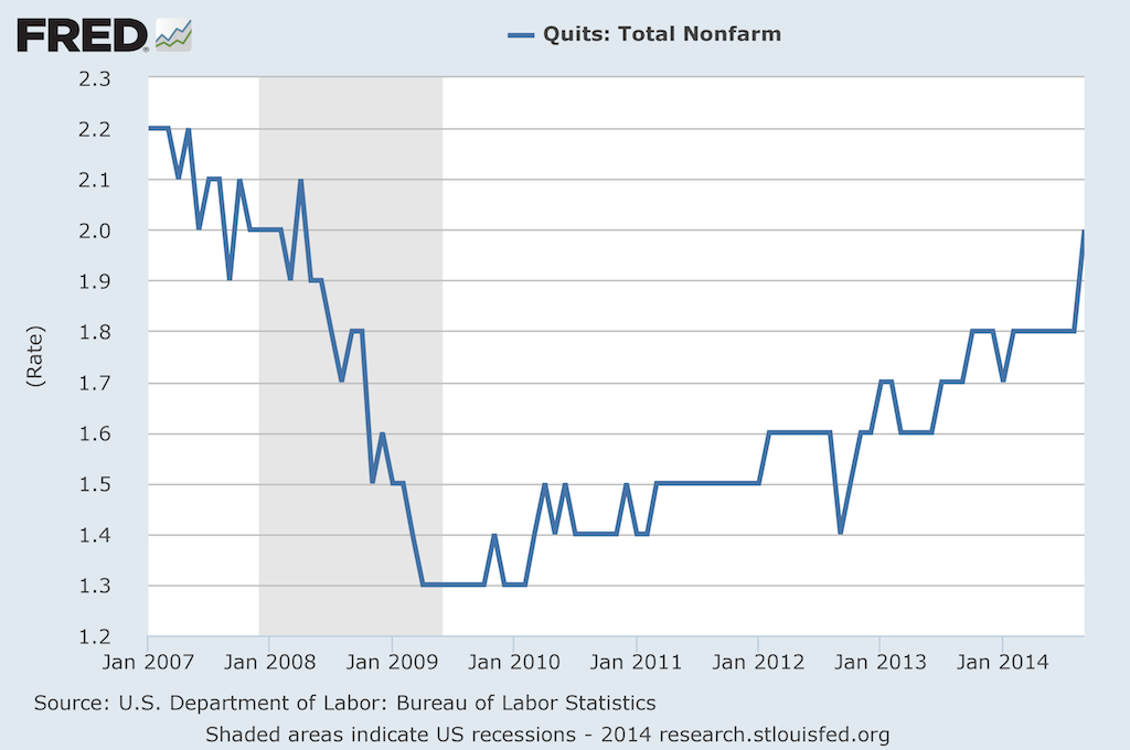
    Wow - pretty simple and clear to see how at least this group of surveyed MRI Network recruiters have seen the labor market shift pretty dramatically in just two and a half years.

    From late 2011, when the sentiment was that that the power and leverage in recruiting was about an even split between candidate and employer, to one where now these recruiters see about a 4x advantage for the candidates, this shift will have some pretty profound implications for many HR/talent pros.

    Quite simply, offers to candidates with desirable, in-demand skill sets are going to have to get sweeter, and they are going to have to happen faster. Digging in to the MRI data you see that the primary reason candidates can't be closed is that they have accepted a different job offer. Sure, there are plenty of factors at play here, but the lesson is that just like in the market for desirable real estate in New York or San Francisco, the market for top candidates is likely to be super-competitive, with candidates holding signifcant leverage and multiple offers.

    One more nugget from the data - candidates accepting counter-offers to remain with their current employer are rising. Whether or not it makes sense to even make counter-offers is definitely subject to debate, but the fact that if you don't at least consider the practice for your in-demand talent, you are likely going to find yourself having to replace at least some of that talent sooner than you might have liked. 

    Looking back over this data, and the last few Charts of the Day I have posted and it continues to become more clear - job openings are up, employees are more willing to jump for a better opportunity, the competition for candidates is getting more fierce, and the strategy and tactics you were using as recently as 2011 probably are not going to work in labor markets where the best candidates have all the power.

    Have fun and be careful out there.

    Tuesday
    Dec092014

    ECON 101: On high, low, and middle-skilled workers

    There is a great analysis on how workers holding jobs in different skill levels, (high, middle, and low) over at the Federal Reserve of Atlanta site that if you are as much of a labor market/macro workforce data geek as I am, I highly recommend reading.

    The question the researchers set out to answer was based in this: We know that from a combination of the most recent economic recession and augmented by persistently advancing automation technology, that so-called 'middle' skilled workers were the most hard-hit group in the last downturn and recovery. What the researchers wanted to understand is what has or is happening to these displaced middle skill workers. Were they still out of work? Were they forced into lower skilled or service-type jobs? Or did they get the opportunity to move into more highly-skilled (and better paying) jobs?

    Note - for the purposes of this analysis, 'middle-skilled' cconsists of office and administrative occupations; sales jobs; operators, fabricators, and laborers; and production, craft, and repair personnel (many of whom work in the manufacturing industry).

    So let's take a look at the data - first the aggregate employment levels since 1998 for each skill category:

    As of September 2014, the middle-skill employment level was still about 9 percent below the (pre-recession) 2007 level. In contrast, employment in low-skill occupations is 7 percent above pre-recession levels, and employment in high-skill occupations is about 8 percent higher than before the recession took hold. So the first assumption, that middle-skilled workers were hit harder by the recession/recovery than workers in the low and high skilled groups seems to have held up.

    But what has been happening to these displaced middle-skilled workers? Surprisingly, many of them are/have moved into the high-skilled classification. About 83% of the displaced middle-skilled workers that are back employed are still in middle-skilled roles. But what about the other 17% of workers?

    Let's take a look at the data:

    The data shows that about 13% of the group has transitioned from a middle-skilled job into a high-skilled one. Only about 3.5% have been driven into a low-skilled role. This may seem like a small percentage of upward mobility, but it still seems significant to note.

    If, as many economists expect, there continues to be further pressure and erosion of middle-skilled workers (which if you take another look at the first chart you will see still make up the largest category), it is important to the overall economy what happens to displaced middle-skilled workers. If they can transition into high-skilled roles, they see on average a 27% increase in compensation, as opposed to a 24% drop if they move into low-skilled roles.

    While this data and these figures seem all kind of abstract and distant, then think about them this way: Think about your life and lifestyle with a 27% raise in compensation. Then think about it with a 24% pay cut. Pretty big difference, right?

    And then take those scenarios, multiply them by 10 million or so, and now you have some feel for how important this issue is for the US economy.

    Monday
    Nov242014

    REVISITED: For American workers, the quits keep coming

    Back in February I posted CHART OF THE DAY: The Return of the Quit, a look at the increasing rate of 'quits', (HR nerds can call them 'voluntary separations' if that makes you feel better), across the American labor market.

    Back in February, the news was that quits were rising from the financial recession low point of 2009-2010, reflecting growing individual confidence in the labor market and consequently placing pressure on organizations to develop retention, replacement, succession planning strategies.

    Fast forward about nine months to the latest data on quits, (Note: this data comes from the Bureau of Labor Statistics JOLTS (Job Openings and Labor Turnover Survey) report), and the story about quits continues to play out along the same lines as I talked about in February. 

    I'm going to hit you with the updated data below, then revisit my (FREE) commentary after the jump. I actually think all the points I made about th February data still apply in November, the question really being if we as organizational talent pros are paying enough attention to this data.

    Here is the latest data, showing the Quit rate climbing to about 2%:

    Some thoughts:

    1. 'Quits' are a function of several factors, (personal circumstances, the magnitude of the jerkitude of your managers, people self-selecting out as not being in the right job, etc.), but most observers of the Quit rate on a macro level ascribe movements in the rate to worker's confidence in their ability to find another, and what they think will be a likely 'better', job.  The rate moving up, to a level that is approaching the pre-recession level, is a signal that overall job market confidence is rising.

    2. So while you and many other HR/Talent pros are lamenting about 'hard-to-fill' jobs, simultaneously more of the workforce are thinking of themselves as 'easy-to-place'. I'm not sure how that apparent paradox will work out, (probably very differently depending on location, skills, etc.), but it is kind of interesting and amusing at the same time.

    3. How you are thinking about and reacting to news of a good employee quitting is probably changing too. In 2008 or 2009, you might have reacted by thinking, 'What is she crazy? Where is she going to find another job with as good pay/benefits/cupcake Friday like we have here?'. Now? Probably you'd think more along the lines of 'Hmm... She's going to XYZ Corp? I wonder if she could bring me over there too.'

    4. Last, while the Quit rate increasing kind of feels like it is a good thing, there is certainly some warning signs as well. For one, those recent quitters might find that their skills and experience are not in as high a demand as they figured, and thus end up spiking the unemployment rate in the short term, (as well as having to take a boatload of grief from people questioning their sanity for quitting a perfectly good job). They might find, even today, that keeping a job is much easier than finding a job. And increasing worker confidence might put pressure on companies to increase wages, which can also have a detrimental effect on growth and profits.

    So take a look at the JOLTS report if you are interested in this kind of data, I think it gives a little more color and depth to the more widely reported headline of the total rate of unemployment.

    Are you seeing an increase in 'quits' in your shop?

    Ready to quit yourself?

    Have a great week!

    Tuesday
    Nov182014

    CHART OF THE DAY: Unemployed vs. Job Openings by Industry

    Today's Chart of the Day comes to us courtesy of the Economic Policy Institute from a short post titled The Number of Unemployed Exceeds the Number of Available Jobs Across All Sectors.

    First the eponymous chart, then as you have come to expect (and demand), some comments from me after the data.

    The EPI piece's author uses this data to make an argument that persistently elevated levels of unemployment, that often are, (at least to some extent), attributed to something called 'skills mismatches', where unemployed workers simply do not possess the requisite skills and abilities that employers demand, are in fact not caused by mismatches, and are in fact driven by depressed overall demand for labor.

    The logic behind this argument is pretty straightforward. If there were indeed large levels of skills mismatches driving unemployment, then we should see, at least somewhere in the economy, particular industry sectors where demand (available jobs), surpasses supply, (available workers in that industry). But as the data above show, every industry sector currently has more supply (unemployed workers), than demand/jobs.

    It is a decent argument, if a little simplistic. It does fail to take into account the many thousands of sub-industries and specific types of jobs that fall into broad categories like manufacturing, construction, or services. It also does not adequately account for the very high likelihood that in certain sectors that workers who have identified themselves as being in that sector, truly have not been willing or able, (possibly because they have been out of work), do keep their skills current and adapted to new demands.

    But taken in aggregate there is a decent argument to be made that if current labor market challenges were the result of skills shortages or mismatches, that there would be at least some specific sectors where there are more unemployed workers than job openings, and others where there are more job openings than unemployed workers. But that is, as yet, not the case and still unemployed workers exceed jobs openings across the board.

    Whether or not there exists widespread skills shortages or mismatches is usually more of a concern for governments or the largest employers. And the nationwide conditions don't really mean much to the small or mid-sized firm that just wants to get its positions filled. But while all HR/Recruiting is local, (to some extent), no firm no matter how small operates in a vacuum. 

    So while these macro-labor market conditions might not move the needle on today's open reqs, they can and likely will impact tomorrow's and next year's and the one after that.

    And that is why I find this data interesting and why it rates for this installment of Chart of the Day.

    Thursday
    Oct232014

    CHART OF THE DAY: Everything you want to know about Labor Force Participation

    I know that I definitely have hit Labor Force Participation a few times in the past in the often imitated but never exceeded CHART OF THE DAY series here on the blog, but now thanks to some really excellent work out of the Federal Reserve Bank of Atlanta I think we have the best source yet for digging into Labor Force Participation.

    From the Fed Atlanta's Labor Force Participation Dynamics micro-site, check out just a couple of examples of what the data shows with respect to Labor Force Participation, that encompasses some important measures of who is actually working, looking for work, or unable to find work from the labor force.

    Chart 1 - The Big Picture - By mid-2014 Labor Force Participation was at its lowest rate since 1978

    Chart 2 - What accounts for this steep decline since the start of the financial crisis and ensuing recession in about 2007? Well, lot's of things, but mostly it is just the population getting older.

    Chart 3 - But what about people in their 'prime' working years? Are they still in the Labor Force in the same proportions history would suggest? Turns out not really.

    Chart 4 - But most of the decline in Participation for 'prime' workers has to be the bad economy, right? Most of the folks in the 25-54 group that are not in the labor force are missing not by choice I bet. They are probably just frustrated but still want to work. Actually, no.

    Turns out that the decrease in labor force participation among prime-age individuals has been driven mostly by the share who say they currently don’t want a job. 

    I know that it can be really hard to see the link from this kind of macro labor force data and the trends in participation to your day-to-day or even year-to-year workforce planning and talent management initiatives. But I am convinced it is important for any business leader to be at least cognizant of the macro trends and dynamics that your organization and your current and future labor force operate in. Plus, charts are fun!

    But ok, enough charts for now, you can check out the Fed Atlanta's Labor Force Participation Dynamics site for even more data and analysis on this topic. 

    Have a great Thursday!