Quantcast
Subscribe!


Enter your email address:

Delivered by FeedBurner


E-mail Steve
This form does not yet contain any fields.

    free counters

    Twitter Feed

    Entries in labor (76)

    Wednesday
    Apr122017

    It's better to have a job when you're looking for a job

    As the 2007-2008 financial crisis and subsequent economic recession fade further and further into the distance, we don't in 2017 talk about unemployment all that much. The sustained recovery in the labor market has pushed unemployment to near "full employment" levels of about 4.5% in the US, and in many sectors and job roles most employers would report 'good help is hard to find'. Until the robots take over. But that is a different story for another time.

    Back to unemployment though. In 2008 and 2009, there was plenty of discussion about the best ways to help the many, many folks who were out of work to get back into the labor force. Lots of job search gurus appeared online, plenty of networking and support groups were created, and certainly significant governmental support, (cars, banking, insurance), was marshalled to try and stop the bleeding in the labor markets and help get people back to work (or keep them in work).

    Around that time, as the unemployment rate topped at about 10%, one peculiar storyline emerged, and pretty consistently as well - namely that folks who were unemployed, and 'actively' looking for work, were often characterized as less desirable candidates than say someone who was currently employed, and may not even be actively looking for something new. The dream 'passive' candidate if you prefer that term. Lots of anecdotes about hiring managers passing on any candidate who was out of work were shared, and plenty of folks, (I possibly was one of them), opined about how unfair that this kind of (for lack of a better word) discrimination against the unemployed was seemingly more and more prevalent. And anecdotal or not, it certainly seemed that looking for a job when you did not have a job was much, much tougher than looking for one when you were already employed.

    But just how much tougher is it, really?

    A recent study by the Federal Reserve Bank of New York looks to put at least some data around these anecdotes by looking at job search activity by unemployed workers, by employed workers, (both passive and active), and people out of the workforce. The entire report is interesting and worth a read but I thought I would tease out two of the report's most interesting findings about job search, and more importantly, job search outcomes.

    1 - Lots of employed people are actively looking for work - almost one quarter of them 'actively' searched in the trailing four weeks of the survey period

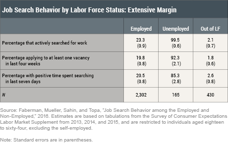
    Not shocking I guess, but also the 23.3% doesn't account for the probably much larger number of employed workers that would be open to at least discussing new opportunities, even if they were not in active search. Said differently, one of the reasons contributing to a bias in favor of employed workers is the fact that just about all employed workers are still in the candidate pool anyway. At least partially in.

    So how does this perceived bias influence outcomes? Here's the money chart from the study, depicting how search behavior and application intensity translate into positive outcomes, i.e. job offers.

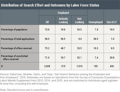
    I will help you with the fine print here. Unemployed workers make up about 7 percent of the survey sample. They send out 40 percent of the total job applications, but receive only about 16 percent of the total job offers.

    In contrast, folks who were employed and were actively looking for work make up about 20 percent of the sample but receive almost half of all offers. Further, the employed not looking for work (and who do not apply for any jobs), receive about one‑fourth of all the offers in our sample—more than the unemployed who are the most active searchers and applicants.

    So how much better is it to be employed when looking, (or in many cases not looking) for a new role?

    Well, according to this data, much, much better. Roughly it takes eight times the effort in terms of time spent and four times the application rate for unemployed folks to generate a similar rate of job offers that employed workers realize - many of whom are not looking for work at all.

    Hopefully we won't have another dramatic economic or market shifting incident like the financial crisis that drives up unemployment and will make these findings and their impacts top of mind again. But it is good food for thought for any of us who may not love the job we have now, and are looking for something better.

    We just might want to hold on to that crappy job as long as we can, because having it makes our odds of finding the next (hopefully less crappy) job that much better.

    Monday
    Mar202017

    CHART OF THE DAY: More on the increasing 'Quits' data

    Quick shot for a busy 'Can you believe my Gamecocks are in the Sweet 16?' kind of a Monday.

    Here's just one chart from the latest release of what regular readers recognize as my favorite labor marker report - the Job Openings and Labor Turnover Survey - aka the 'JOLTS' report. 

    This chart illustrates the amount of 'Quits'  better known in HR speak as Voluntary Separations, compared with the amount of Layoffs and Discharges, AKA, 'Pack your things, son, it's time for you to go' deals.

    Here's the latest chart of this data, then as we all have come to expect by now, some FREE comments from me:

    Three quick observations...

    1. Really interesting right now that these two lines continue to get farther apart, and the gap between Quits and Layoffs/Discharges continues to increase. The delta between the two series is now 1.6 million, with Quits hitting 3.2 million in January, against 'only' 1.6 million Layoffs/Discharges.

    2. The continuing increased in the level of Quits is generally seen as a proxy measure for the overall health of the labor market. The thinking goes that when employees feel more confident in their ability to find alternative work, (either at another company or for themselves), then they are more likely to 'quit' the job they have now. It is a seller's market for labor in some sense. 

    3. If this trend continues, and labor markets continue to tighten, (you can also look at total job openings to get a sense of this), then employers will (according to the immutable laws of supply and demand), be forced to take counter measures. They can either look to reduce 'quits' by raising wages, improving benefits, or striving to become less crappy places to work. Or, they can look to alternate sources of labor - offshoring, outsourcing, automating, etc., in order to find the talent/labor they need.

    The slow and steady economic recovery since the bottom of the last recession marches on. Unless something changes relatively soon, 2017 is shaping up to be a good year for folks who are in demand, have negotiating leverage, and are feeling as confident as ever in their ability to control their careers.

    Have a great week! 

    Go Gamecocks!

    Monday
    Mar062017

    CHART OF THE DAY: The World Economy in One Chart

    You may have seen this chart passed around a week or two ago when it was published on Visual Capitalist, but as I was digging through my 'Read Later' pile over the weekend I felt like it was too good and interesting not to share.

    So without further delay,  visual look at the global economy, represented by country contribution to global GDP, and then as you DEMAND, some free comments from me after the data.

    (Email and RSS subscribers may need to click through to see the chart, and clicking on the chart will bring you to a much larger version)


    Courtesy of: Visual Capitalist


    Really interesting and cool chart, right? Three quick observations from me about what 'normals' like us should be thinking about when looking at the data.

    1. Go USA! Ok, not trying to be too much of a cheerleader here. But while many other economies (namely China, but I will get to that in a second), have emerged on the world stage in the last twenty or thirty years, the USA still accounts for a shade under a quarter of World GDP. This is important for organizations, particularly US-based or centric organizations to remember even as they make their plans for international expansion. It probably would be a mistake to concentrate too much time and energy on markets that either are relatively small, (say the Netherlands or Spain), or not expected to grow as rapidly in the next ten years, (Germany or the UK).

    2. Don't sleep on China, (and to a lesser extent Japan and India). I know that it can be hard for many US businesses to wrap their minds around places like China and Japan. It is hard to to business there. The language and cultural barriers are more significant than say in Western Europe. It may take longer to establish a presence there. But make no mistake, future growth is being defined by what is happening in Asia - not in Western Europe. It may take a little more time, but the organizations that can make the investments, get in front of their competition, will be better equipped to capitalize in the parts of the world that are growing the fastest. 

    3. Perspective is really the biggest takeaway from a chart like this I think. We can, here in the US, get really full of ourselves,(see above), and it is a good reminder that even as the largest economy, more than 75% of economic activity is happening elsewhere. Insert your own country in the above sentence and the percentages get even more sharp. Places that we think of as economic leaders like Germany and the UK contribute less than 5% each to global GDP, while seemingly set up for being surpassed soon by places like India and South Korea. None of us are all that big a deal.

    Anyway, that's it from me for a busy Monday - have a great week!

    Friday
    Feb172017

    CHART OF THE DAY: Report from Startup Land

    I don't like to get too caught up in tracking and detailing the latest trends and moves in HR, Talent, or even workplace technology emanating from Silicon Valley. After all, the vast majority of us do not work in go-go startups, can't really empathize with most startups particular challenges, and the rules of engagement for HR and talent leaders at 30 year-old manufacturing companies with 2,600 employees are naturally, (obviously), different than at a new 12-person 'Uber for XYZ' startup in Palo Alto.

    But on the other hand if you generally believe that innovation in technology, service delivery, and even 'HR' things like benefits, workplace design, and employee experience does often start at 12-person 'Uber for XYZ' startups, as they are unencumbered by size, tradition, understanding of the 'rules', and simply often too busy to worry about HR things and just get to work, then keeping an eye on what is happening in the Valley can be a useful exercise for any HR and talent pro - no matter what size and type of organization you are in.

    One recently published set of snapshots on what is happening in Startup Land comes to us from Silicon Valley Bank in the form of their 2017 Startup Outlook Report (US).  It is a really interesting look at some of the trends, challenges, and points of view from their survey of leaders of 941 global startups, 62% from the US. I want to share three charts from the US portion of the report, with a comment or two for each, then send you on your way for the (long) weekend.

    Chart 1 - The 'War' for Talent

    You'd expect that a majority of startups would report difficulty in finding the people they need to grow their businesses since many of these startups are in technology fields where the tech itself may be new, and the competition for people with these often very hard to find skills is fierce. But 90% plus saying it is challenging or extremely challenging to find talent? I must say that even surprised me. Even though the percentage ticked down a bit, 9 of 10 startup leaders showed up to work today probably worried about finding talented people.

    2. Gender diversity is not improving

    While it probably is not surprising that most startups have mostly male leaders and mostly male boards of directors, what is at least a little surprising, given the increased attention on this issue in the last year, is that surveyed startups are getting more male at the leadership and board levels.  Buried behind this chart is the note that about a quarter of surveyed firms have formal programs in place to increase female representation in leadership roles. But a quick look at the above data suggests that these efforts are not moving the needle at all.

    3. Despite it all, almost all of these startups are hiring

    It is the nature of a startup to grow and hire, so you'd expect these numbers of firms looking to increase headcount in 2017 to be high, but it is pretty encouraging to see that this number has remained consistently high over the last few years. And this is really good news for the kinds of people that these startups are likely to be after - highly skilled, proficient in the latest technology, and able to add value right away. There's a reason why 'Data Scientist' is sometimes called the best job in America today. Although I'd argue that 'Stretch Four' would be better. Non basketball fans, Google that one.

    Lots of other interesting data points in the 2017 Startup Outlook Report - I encourage taking a few minutes to read it through. You might not be an HR pro at a Valley startup, but you just might be competing with some of them for your next Data Scientist.

    Have a great weekend!

    Monday
    Feb062017

    Want a larger piece of the (economic) pie? Look for the most competitive industries

    Caught a really interesting piece over the weekend at The Atlantic looking at one potential reason why (relatively speaking) that worker's or labor's share of GDP is decreasing when compared to 'capital's', i.e. ownership's share. This divergence in share has been thoroughly examined as a primary driver of increasing economic inequality, and was the main subject of Thomas Piketty's influential Capital in the Twenty First Century from 2014.

    Said differently, and much more simply, today in the aggregate is getting a smaller piece of the overall economic pie than in the past. There are tons of data points you can examine on this, but they all more or less show the same thing - on average, workers are no better off today, and might be worse off, than they were 20 or 30 years ago.

    Why The Atlantic piece titled One Reason Workers are Struggling Even When Companies are Doing Well caught my attention is that it shared some insights from a recent NBER research paper on not just that this share divergence is happening, but offered some reasons as to why it is happening.

    And the theory is kind of an interesting one, and if true, can help better inform anyone making career/industry decisions moving forward. Best of all, it is a pretty simple idea that boils down to this - The more concentrated an industry is, (fewer competitors and the ones that dominate are all pretty large), the lower labor's share of the income for that industry will be.

    Here's some color from The Atlantic piece:

    The researchers looked at data from the U.S. Economic Census between 1982 and 2012 for nearly 700 industries in six major sectors, including manufacturing, retail, wholesale, services, finance, and utilities and transportation. Looking at how much the four largest firms in each industry accounted for in terms of total sales in the industry, they found an upward trend in concentration in all of the six sectors, meaning that it was increasingly common that just a few firms accounted for the bulk of sales. Since the U.S. Economic Census reports payroll, input, and employment, the researchers were able to observe a negative correlation between concentration and labor’s share—meaning that this trend of so-called superstar firms tends to mean workers taking home a smaller share of the pie. Moreover, the more concentrated an industry had become, the larger the decline in labor’s share.

    Unpack that a little bit to show a pretty straightforward formula:

    Industries have tended to consolidate over time --> the more dominant the four largest firms in an industry become --> then decreasing shares of the overall industry profits find their way to workers/labor.

    There are a couple of reasons on offer for why more consolidated, big-firm dominated industries are getting worse in terms of share of profits for workers. One is that these companies are simply growing revenues at a faster pace, and labor costs just have not (or do not need to) keep pace. Another is that modern, transparent business practices make it easier for consumers to find and reward the 'best' companies, which drives out competition in the industry faster than before - and reduces the potential number of firms competing for workers.

    The takeaways for the average employee?

    Probably that it might pay, (no pun intended), to keep on eye on the relative levels of competition in your industry, particularly if you are in a role that feels industry-specific. If your industry has seen consolidation with weaker competitors being driven out of business (or being acquired), the trends suggest a shrinking percentage of profits will find their way to you and your colleagues.  

    You might be better off thinking about an industry that seems to have more, and more even competition, where the market share, (and to some extent the demand for labor), is not being controlled by two or three big companies. And one where the threat of competition for your skills can either score you a better offer somewhere else, or give you more leverage and power in your next compensation negotiation with your current shop.

    More options might not be better for the owners of your company, but they might be much, much better for you.

    Have a great week!

    Page 1 ... 4 5 6 7 8 ... 16 Next 5 Entries »