Quantcast
Subscribe!


Enter your email address:

Delivered by FeedBurner


E-mail Steve
This form does not yet contain any fields.

    free counters

    Twitter Feed

    Entries in chart (85)

    Monday
    Nov162015

    CHART OF THE DAY: In a world of infinite choice, we choose very little

    How many apps do you have installed on your smart phone? 50, 60, maybe more?

    How many TV channels does your cable or satellite TV subscription offer? A couple hundred, give or take?

    How many websites are there on the internet? Way, way too many to count I bet. Probably something in the order of tens of millions at least.

    So after thinking about those questions, let's ask another set of questions. How many apps, websites, and TV channels do you regularly use/visit/consume? What it the number of these apps, etc. that tend to dominate your time and attention?

    Take a look at the chart below, taken from a recent presentation given by business strategist Michael Wolf at a recent Wall St. Journal conference, for some insights into these questions, and then as you have come to demand, some FREE commentary from me after the data.

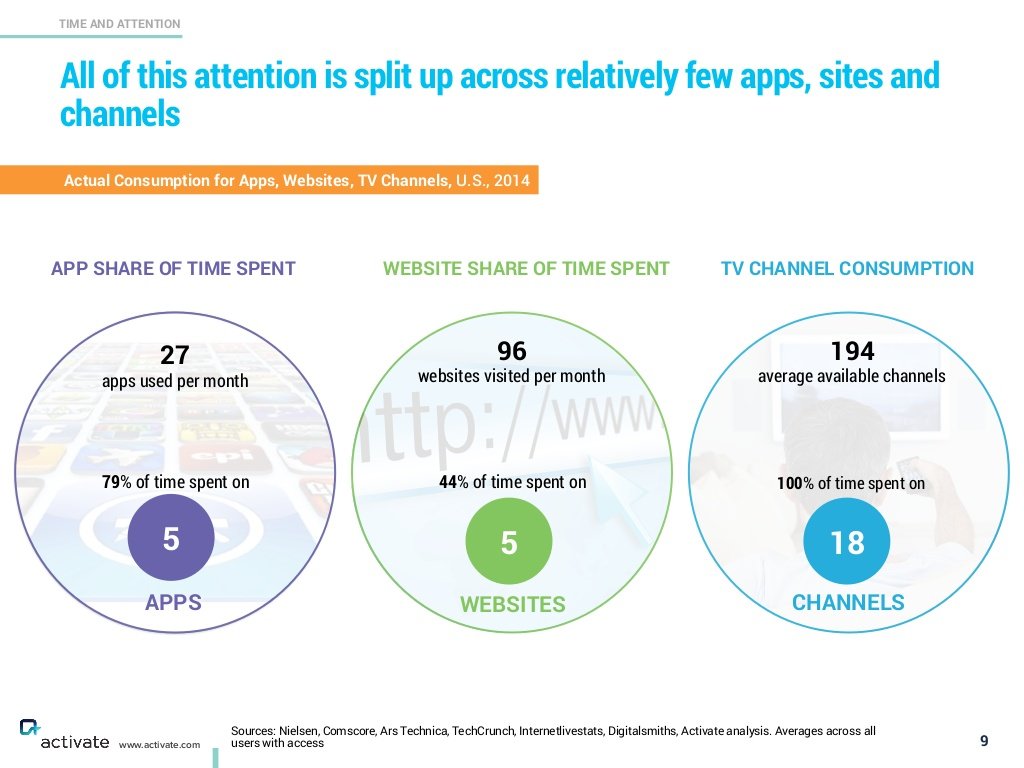
    Interesting data, let's unpack it a little here and see what it might mean for HR/Talent/anyone trying to get attention in a busy world. 

    The average person uses 27 apps in a month, but about 80% of that time is spent in only 5 apps. I will offer up my top 5 - Gmail, Twitter, Zite (a news aggregator), Feedly (an RSS feed reader), and The Score (a sports news and scores app). But whatever your Top 5 apps may be, chances are good they dominate your time on your phone to a significant extent.

    This same self-selected narrowing of almost endless choices also is seen with the general internet, and with TV content. We have tons of options, almost too many, yet we end up gravitating and focusing on those very few choices we seem to enjoy and identify with the most. And again, those lists are pretty small. 

    What should this data make us think about in more general terms as we try to pry precious attention and eyeballs towards our bright shiny new things?

    1. We choose very little, but the 'pie' is so big, even a tiny sliver is huge. With the continued growth of market penetration of smart phones, broadband connections, and wifi everywhere - more and more time is being spent online in all of its forms. Your app or website or internet show or podcast doesn't have to break into anyone's Top 5 to still be a huge success. You just have to identify, target, and create value for that small group that will be open and ready for your message. The HR Happy Hour Show that Trish McFarlane and I do is a great example of this. We may not be 'Serial', but we have a fantastic and growing audience of HR and HR tech fans and have built a really cool thing.

    2. Habits are really hard to change. You, me, everyone - we check the same 5 apps, the same 8 websites, watch the same 10 TV channels week after week after week. If you can't easily get folks to change their consumption habits then you have to find a way to better integrate with these habits. No one hates email more than me, but I still spend more time in email every day than I care to, and I still get plenty of news and information from this old habit. So it makes sense to focus at least some on getting your message better read in email or in one of the other 'Top' apps today (LinkedIn, Medium, Quora, Snapchat, etc.), instead of creating something brand new that requires users to adopt a new habit. 

    3. Don't 'break' things that are working. Once you have an audience, or a set of fans/followers etc., you have to be careful not to mess around or experiment too much all at one time. It is hard enough to initially earn the attention of the audience you seek, it is even harder to have to try and earn them a second time. As your audience grows you want to be sure you are growing along with them, but not leaving them behind if that makes sense. I'd like to run 'Ranked' posts every day, but if I did I am pretty sure I would drive away just about everyone who I have spent 7 or 8 years trying to connect with. But the occasional Tom Cruise or Ranked post is fine I think.

    No one has time for all the choices that are now available to us on our phones, the web, and our TVs. That doesn't mean there is not any room or any opportunity for something new to break through, it just means that the ideas that can break through are rarer than ever, and the people that can conjure up these ideas are more valuable than ever.

    Ok that's it, I am out. Go back to the sites/apps you really enjoy. 

    Have a great week!

    Thursday
    Oct082015

    CHART OF THE DAY: If you're feeling old, you're not the only one

    Super simple, yet cool Chart of the Day on the graying of America courtesy of the Chmura Economics Blog - let's take a look at the chart then as you continue to demand, some FREE commentary from me...

    Wow, check the growth of the 60+ age cohort from 2000 - 2030, amazing how the other segments remain (relatively) flat, while just about everyone else, (you and me too), get a heck of a lot older.

    Why should we care about this? A few reasons I think.

    1. These general demographic trends combine with observed and predicted workforce composition trends to point to a future where the average worker will be older, will plan on working longer, and where qualified 'new' workers will be even more in demand. If your company is not one where these in-demand younger workers will want to be, then you are going to have to get used to an older workforce than you have had before.

    2. How does a relatively older workforce actually translate to HR/Talent programs? Increased need for re-training, as careers lengthen but needed skills continually change, higher reliance on benefits more likely to be used by older workers and less on those that tend to be leveraged by 20 or 30-somethings, and finally a need to be more aware and deliberate about how more widely spread age ranges can effectively work together. 

    3. Deeper in the Chmura data, they break down this 'aging effect' by US state/county, (I was not able to embed the map here, but you should click through to check it out). As you might expect, the effects of the aging population/workforce composition will differ by locality. You might want to pinpoint the county(ies) that your organization has set up shop in order to get a feel for how quickly and how pronounced the aging effect is expected to be where you need to recruit and retain.

    Bottom line, it is probably a good idea to be aware of the big shifts in demographics, at least until you have figured out a way to replace all of your workers with robots.

    And looking at how much older we all seem to be getting, you might want to accelerate the robot recruiting sooner than later.

    Friday
    Sep112015

    Remember Harvard Graphics?

    I saw this clever post yesterday, titled Computer Science Courses That Don't Exist But Should, and one suggested course in particular really stood out:

    CSCI 3300: Classical Software Studies

    Discuss and dissect historically significant products, including VisiCalc, AppleWorks, Robot Odyssey, Zork, and MacPaint. Emphases are on user interface and creativity fostered by hardware limitations.

    While I am not nearly geeky enough to know all of those old products, (the only one I recognize is VisiCalc, and I never even used that), it made me think back on my introduction to software and workplace technology more generally.Pretty slick UI, right?

    And the one 'classic' piece of workplace tech that I remember most fondly, for reasons I will share in a second, is Harvard Graphics, the first general use charting and data visualization tool to gain acceptance in the office. In the late 80s and maybe a little into the early 90s, Harvard Graphics was the go-to tool for creating at that time were really amazing bar, pie, line, and other types of charts that today we would just laugh at for their simplicity. But pretty soon Microsoft Office took over the office, and Harcard Graphics pretty quickly fell out of fashion.

    But I loved my time with Harvard Graphics. Back in the day, when the first colorful stacked bar chart of regional sales broken out for the last 4 quarters emerged from the plotter, (look that one up, kids), and I marched it in to the CFO's office, suddenly I was looked at not like the 22-year-old kid who knew nothing, but as the 22-year-old kid who created something cool.

    After getting a glimpse of what the HG program could do, the CFO started setting me off to make more and different kinds of graphical representations of our financials that would be used in exec meetings, sent out to the regional presidents, and often tacked up on the wall in the CEO's office. No one would ever tack a boring looking income statement on their wall, but a 3-D multi-colored bar chart of gross profit margin by product segment? That was high art to some of these guys, and I was the only person in the office, (probably because I could not add much value anywhere else), that was able at that time to produce these charts.

    That simple little program, and the rest of the office's reluctance to embrace anything new or seemingly complicated, helped me cement a reputation as someone clever, useful, and for being what then passed for technically savvy - which make no mistake helped out your career as much back in those days as it does today.

    Harvard Graphics got me at least two raises I am pretty sure.

    Ok, the walk down memory lane is over. Have a great weekend and think about this little tale the next time some new and scary and complicated technology shows up in the office.

    It just might be the one that gets your work tacked up on the CEO's wall. 

    Thursday
    Sep102015

    CHART OF THE DAY: More open jobs today than since... well, since ever

    If the title of this post sounds familiar, well it should because I ran a post with this exact same title back in June. At that point the chart that accompanied the post showed that open jobs in the USA as of the end of April sat at 5.4 million, at that time the most that the Bureau of Labor Statistics JOLTS report had ever reported.

    Fast forward a couple of months and we have yet another record high number of job openings in the USA as reported in the latest JOLTS report, climbing to 5.8 million as of end of July. Check the chart below and then, as you have continually demanded, some FREE comments from me after the numbers.

    Some quick takes....

    1. Wage pressure has to, has to be coming even more than in some of the pockets that we have already seen increasing wages. With this many open jobs, and the labor force participation rate still pretty low by historical standards, rising wages have to be one of the options employers turn to in hopes of filling some of these jobs. You can push 'great culture' and 'summer hours on Fridays' as much as you want, but at the end of the day many, many candidates have many, many more options than ever. 

    2. As I wrote last time I showed this chart, even increasing wages might not be enough in a candidate-scarce market. Are you still telling 37-year-old new hires they start at 10 days vacation, accrued in 4-hour increments every two weeks? Are you still making outside sales people show up at some central office every day when they really have no need to do that? Are you still making and enforcing rules that anyone with options will not tolerate for any longer than they need to?

    3. It could be time when you (finally) push hard for a strategic increase in your internal development initiatives. Certainly some component of the record high in job openings stems from organizations that just can't find people with the right set of skills and experiences. But since the market continues to send messages that it will not suddenly or miraculously begin producing more of these ideal candidates, you have to figure out some other means of filling these gaps. Maybe you have to get more creative with apprenticeships, college and vocational partnerships, and/or upskilling your own employees to fill the roles that the market can't seem to provide.

    I love this chart. I love it when people have options, have opportunity, and hopefully, some leverage in the typically employer-driven recruiting game.

    Good luck out there.

    Monday
    Aug312015

    CHART OF THE DAY: All email, all the time

    So I have a theory about this week, the week leading up to the long Labor Day weekend in the USA, and the unofficial end of summer. After Labor Day the kids are all back to school, vacations have pretty much all been taken, and all of a sudden you realize that there are still 18 big unfinished items on your 'Things I wanted to get done in 2015' list.

    So this week is it, the last 'fun' week more or less, before the end of year holidays kick in. So have fun. And don't expect too much out your humble correspondent this week either. I want to enjoy the end of summer too.

    Full disclosure: I did not want to blog about email AGAIN. Even I am sick of it. And it kind of doesn't matter anyway. But over the weekend I (once again) received at least a dozen or so work-related emails, none that I would classify as urgent, and by the end of Sunday night I couldn't help but have email (again) on the brain. 

    Please stop emailing people on the weekend. Really. I am begging you. 

    Anyway, here is the Chart of the Day, I almost forgot that was the point of the post. According to some recent data spotted on Business Insider it seems like for most folks email is either an obsession, or something you don't care much about at all. 

    Let's take a look at the data, then some FREE comments from me after the chart:

    What to make of this data - where the vast majority of people either are on email all day long or just once or twice a day?

    1. It should be really, really easy to figure out what kind of person (a check all day or a check once a day type) you are dealing with after one of two email exchanges. From the data we see that from the wide divergence in how often people like to deal with email making any kind of assumption about expected email responsiveness is probably a bad idea.

    2. People who check email all day long every day often cannot understand and have little patience for folks who fall on the other end of the spectrum. Think about your own preferences and usage of email. If you are constantly on your email all day long just how frustrated do you get with people who do not share your email obsession/enthusiasm. 

    3. This isn't an email-specific take, and really doesn't have anything at all to do with the chart, but I wanted to share that I finally came to my senses and turned off just about all visible and audible notifications in my phone. The only time my phone now 'pings' me is when I am getting a call or a text. No more email notifications, no more 'someone mentioned you on Twitter' alert, no more 'breaking news' type messages. It is remarkable how much better and I hope healthier I feel about my relationship with my phone.

    Ok, that's it, I am out. It is still summer after all. 

    Have a great week!