Quantcast
Subscribe!


Enter your email address:

Delivered by FeedBurner


E-mail Steve
This form does not yet contain any fields.

    free counters

    Twitter Feed

    Entries in chart (85)

    Friday
    Mar182016

    CHART OF THE DAY: The End of Soda (or Pop, if that's how you roll)

    Quick shot for a busy Friday, today's chart is from our pals at Business Insider and shows what BI calls an 'epic' (I'd say it is more 'moderate') decline in per capita soda (or pop) consumption in the USA over the last 18 years.

    Here is the chart, and after that, as always, some FREE commentary from me after the data:

    The headline number is that per capita soft drink consumption has declined from a peak of 53 gallons in 1997 all the way down to 40 gallons in 2015. So just about a 25% decline. Still 41 gallons is a lot of soda, (observed as I down my second Diet Dr. Pepper of the day).

    Why is this important? I am note sure it is, but to me it is at least interesting.

    Could it be, at least by this one measure, the public is finally getting more concerned about the ill effects of the consumption of empty calories from sugary drinks? Or maybe the focus on employee wellness and well-being by lots and lots of organizations is having a positive impact on people's habits with respect to soft drink consumption? Perhaps it's a generational thing. Do 14 year olds like to drink Coke or Mt. Dew?

    Of could it be a simple lack of innovation by the soft drink makers themselves? After all, while we love and praise innovative companies, the second that Coke or Pepsi messes about with the formula or our favorite drink the backlash is immediate and the outrage is enormous.

    Who knows for sure? But as an observer of the world, I find it interesting for sure. Perhaps you do as well.

    Have a great weekend!


    Tuesday
    Mar012016

    CHART OF THE DAY: How large is the 'gig' economy?

    In my 'What HR should and should not be talking about in 2016' piece from early January I had the 'gig' economy listed as one topics that we collectively needed to stop talking and thinking so much about this year. By way of refresher (mostly for me), here is what I said in January about the 'gig' economy:

    "The 'Gig' Economy - Here's the thing about the rise in importance of the so-called 'Gig Economy', it is quite possible that its growth as a percentage of the labor force has been generally exaggerated possibly due to the oversized coverage that the largest Gig company, Uber, has received over the years. According to this Wall St. Journal piece from last July:

    Far from turning into a nation of gig workers, Americans are becoming slightly less likely to be self-employed, and less prone to hold multiple jobs. Official government data shows around 95% of those who report having jobs are accounted for on the formal payroll of U.S. employers, little changed from a decade ago.

    If Uber and its ilk were fundamentally undermining the relationship workers have with employers, that shift would be showing up in at least some of the key economic indicators. Hundreds of thousands of Americans, or even a few million, may have dabbled in the gig economy, but in the context of the 157 million-strong U.S. labor force, the trend remains marginal.

    It is possible that since there are likely more 'Gig' workers in coastal 'elite' cities like New York and San Francisco, and folks in these cities dominate the conversations in the media, that it just feels like the Gig economy is fast becoming the dominant form of work. But the data just doesn't reflect that, at least not yet. And it likely will not in 2016 or in 2018 or maybe even in 2020. So for now, it makes sense to think about your labor force composition, sure, (just like it always has), but massive, fundamental changes in that mix of labor is not typically top of mind for most organizations."

    So that was my take in January and two months later I have not really seen much if anything to make me think any differently about how important/influential the 'gig' economy really is to the vast majority of workers, organizations, and HR leaders. Today's CHART OF THE DAY courtesy of the JPMorgan Chase research folks seems to back that conclusion up.

    Taken from a three-year study of over 1 million JPMorgan Chase customers, the survey titled 'Paychecks, Paydays, and the Online Platform Economy' attempted (among other things) to get a better understanding over a three-year period just how important the 'gig' economy was/is in terms of worker participation levels and contribution to overall individual income. The entire report is interesting, but the chart I want to share is below, on the overall participation rates in 'gig' work. Here is the data, and the as you demand, some FREE comments from me:

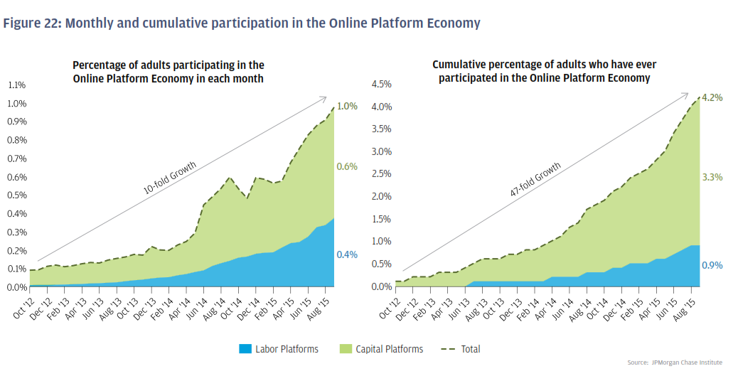
    Apologies if some of the figures on the charts are a little tough to read, so I will just repeat the headline numbers - in Sept. 2015 the final month of the study, about 1% of individuals earned income from the 'gig' economy. In the second chart we see that in the 3-years of data up to Sept 2015, that about 4% of individuals had at any time earned income from the 'gig' economy.

    So 1% of JPM's surveyed customers were active on Uber, AirBnb, EBay ,and the like in Sept 2015 and 4% of people overall at some time earned some income from working (or selling things), on one of these platforms.

    While both figures represent significant growth in the reporting period, both were growing from incredibly small starting points. The truth is that the vast majority of people are not participating in these platforms and the ones that are, (another major section of the survey data), are using it as a supplement to more 'regular' forms of income, i.e. 'normal' jobs. Said differently, the chances are the only Uber drivers you have ever met are the ones that have driven you somewhere.

    To get back to my original point from January, while we read lots and lots about the 'gig' economy, its actual impact and influence on most worker's lives is not all that significant, at least not yet. If you are at all interested in this kind of data, I encourage you to check out the full JPMorgan Chase study here.

    Tuesday
    Jan052016

    CHART OF THE DAY: Is it a good time to find a quality job?

    Guess what? CHART OF THE DAY is back for another year of stats, data, and information about work, labor markets, demographics, basketball, and Tom Cruise movies. 

    For new blog readers, here is a quick reminder of how CHART OF THE DAY works. First, I find what I think is an interesting chart, graph, Venn diagram, or my favorite an exploding Pie chart that helps visualize some data set I find intriguing. I re-publish the chart here with a link back to the original source. Last, I toss out 2 or 3 thoughts on the data's significance or relevance for those of us in the HR, talent, technology, workplace spaces.

    Got it? Okay, here goes...

    For 2016's first submission courtesy of Business Insider and Gallup, a look at what American's think about the question "Is it a good time or a bad time to find a quality job?"

    Some quick thoughts about the data:

    1. Gallup has been asking this question in their surveys since 2001, and the latest data from 2015 that shows the percentage of Americans that feel it is a good time to find a quality job sits at 42%, which is just a shade under the series' all-time high of 43% from 2007. Said a little differently, since 2001, according to this survey American's attitudes about the job market conditions have NEVER been more optimistic.

    2. Gallup didn't specifically survey people 'actively' looking for work, so we can assume the increased confidence in the labor market is a reflection of the broader population's attitudes. That means just about everyone is feeling if not good, at least relatively better about labor market conditions. Which translates to the likelihood of increased turnover, even for those employees that you thought were 'safe', i.e., not likely to seek opportunities elsewhere. Will 2016 be the year that more people seek greener grass elsewhere? Maybe so.

    3. The recent HR technology trend towards developing 'predictive' models for providing insights into things like attrition and retention can provide tools that can possibly help HR leaders in this area. But the key question I would ask my HR technology provider of such predictive tools is the extent to which, if at all, these tools take into account these external trends in worker attitudes. Does the tool adapt to reflect the macro-trends and environmental conditions that exist and impact organizations? Or will your 'predictive' tool really act like more of a 'reactive' tool, failing to adapt quickly enough to changing market conditions? Good questions to ask. 

    Ok that's it, I'm out.

    Happy Tuesday! 

    Wednesday
    Dec162015

    CHART OF THE DAY: The Technology Adoption Curve

    Super piece on the BlackRock Blog from a few days ago titled The Topic We Should All Be Paying Attention To (in 3 charts), that is the source of today's Chart of the Day.

    BlackRock is a major player in the financial/investment banking space, so the main point of their post was that instead of the seemingly endless hand-wringing amongst many financial markets observers in the US in the last 6 months or so regarding the potential .25% increase in the Fed Funds rate, folks should be thinking about the US economy much more holistically. 

    BlackRock's piece did have 3 charts to back up this point, and all are excellent, but I picked the one below, on the historical technology adoption curve for a selection of consumer technologies in the US over the last 100 years or so. I love this chart, have used a similar one in the past in some presentations I have done, and will happily steal this one in the future.

    Here is the chart, then as I am compelled, some FREE commentary from me after the data:

    As we can see from the data, in the last 15 years or so the technology adoption curves for some more recent tech innovations have become much, much steeper, almost vertical. It took the telephone maybe 50 years from its introduction to become almost universally adopted; more modern inventions like cell phones and PCs have taken maybe half as much time to reach similar adoption levels.

    Technologies are becoming widely, almost completely adopted much faster than in the fairly recent past. And while that is noteworthy in itself, the nature of and how many of these technologies are being utilized for 'work' purposes is perhaps even more important. 

    Many of the older technologies like radio, television, and microwaves were mostly about personal, in-home usage, and primarily oriented around improving the quality of leisure time. But in the last 20 years or so technologies like cell phones, the internet, and tablets, while still all offering a 'leisure' set of capabilities, have also become essential work and productivity tools and platforms for most everyone.

    So not only are modern technologies becoming adopted more rapidly, they also are more likely to begin as or at least evolve into tools for work, commerce, and productivity. We never really (unless you worked directly in the industry), gained much income or market share or anything from watching more TV or listening to the radio in your car. In fact, these technologies often took you away from 'work'. And that is not necessarily a bad thing.

    But now whether it is your iPhone, wifi everywhere, your 'work' Twitter account you use to share job openings at your company - today's technologies are as much about getting stuff done as they are about avoiding the things we ought to be doing.

    No judgment from me on that. Just an observation. I love technology. It is letting me 'work' on this post at the same time as I am watching a bunch of oversized men play a kid's game in an arena 1000 miles from here.

    Have a great Wednesday!

    Tuesday
    Dec082015

    CHART OF THE DAY: We can FINALLY stop talking about millennials

    In what has to be interpreted as a signal to the tens of thousands of workplace/leadership/management professional speakers and pundits out there that it is time (finally), to update those PowerPoint decks from 2009, it looks like we need to stop or at least slow down our collective fixation with Millennials.

    Take a look at today's Chart of the Day, courtesy of the fine folks at Goldman Sachs and let's together pour one out for the Millennials and raise one up for what is coming next. Here's the chart and as you have persistently demanded, some comments from me after the data:

    Awesome looking chart, right? And from the looks of it, it is time to stop worrying so much about the Millennials and start thinking about Gen Z! What might this mean to the rest of us - besides all the 'Generations in the Workplace' people that need to update their slides I mean?

    I have three quick takes, then like the Good Gen X-er I am have to go make the donuts...

    1. Technology - this is the first 'post-internet' generation. They have never known a world without almost constant connectivity, ubiquitous wifi, and life attached to their devices. Waiting for any kind of information is something they are not used to, nor will tolerate very well. Everything has to move faster, be more easily consumable, and actionable. If you thought the Millennials were annoying, just wait until your first set of Gen Z employees comes through the doors, (very soon), and laughs at your antiquated set of systems and processes.

    2. Diversity - In line with the increasing diversity in the population overall, Gen Z will be the most diverse generation in US history. According to Goldman, the majority of Gen Z will be non-white by 2020 or so. And with this diversity in composition, it seems likely that Gen Z-ers will also be the most accepting of diverse workplaces and teams. In fact, many of them will not even consciously think about 'diverstiy' in the ways that Gen X and Boomers always have, (and have needed to). To Gen Z, the team won't really seem 'diverse', it will just seem like 'the team.' I am not smart enough to know exactly what that means for corporate diversity and inclusion efforts, but I bet it will mean something.

    3. Backlash - In about three minutes from now, someone will take a shot at me or at this post for 'generalizing about the generations'. This person will probably be an older Gen X-er or possibly a Boomer. These people are cranky and should be ignored. Yes, I know not every Gen Z-er is the same and not every Boomer is some kind of Luddite. EVERYONE knows this. The point of talking about generational groups and trends is not to try to explain the motiviations and actions of EVERY SINGLE PERSON IN THE WORLD. The point is to try and make sense on a macro-level of how the shared experiences and enviroments of people who grow up in similar cultural, societal, and economic circumstances impact how they see the world and what that means for the world. And I think having that kind of understanding, or at least having the discussion, is important and valid.

    Ok, that's it from me. What say you? Do you care about Gen Z at all? Or are you happy (like I am), not to have to figure out how to spell 'Millennial' all the time?