Quantcast
Subscribe!


Enter your email address:

Delivered by FeedBurner


E-mail Steve
This form does not yet contain any fields.

    free counters

    Twitter Feed

    Entries in chart (85)

    Friday
    Jul292016

    CHART OF THE DAY: Big Trends in Working Age Population

    Super quick hit for a summer let's-get-out-of-here-and-head-to-the-beach Friday where, at least here in the USA, many of us are going to tire of the phrase 'Corn Sweat' (go ahead and Google it).

    Today's chart comes from our pals at the Economist, from a piece titled 'Vanishing Workers'. First the data, then some quick observations from me before you can power down and crack out the sunscreen.
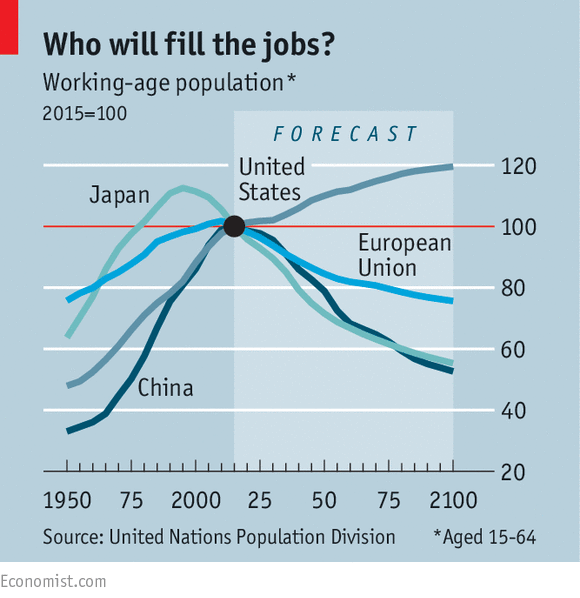
    In a nutshell, this data suggest the working age populations, (15 - 64),  in China, Japan, and Europe are all set to fall (relative to a 2015 baseline), somewhat dramatically in the next few decades, while by the same measure, this group will continue to rise in the US, (albeit at a slower rate than the recent past).

    What happens (in general), when there are relatively fewer available workers, and what might be the implications in the USA where we will be bucking against this trend?

    1. Fewer workers generally lead to rising wages, at least in the near term. And there is plenty of evidence of this already happening in China, where increased competition for workers (especially in manufacturing), has driven up wages for these workers, and made many firms think again and re-evaluate the cost advantages of locating these kind of operations in China.

    2. Falling working age populations impact industries in different ways. With fewer workers, (and an increase in the dependency ratio, the total number of children and elderly divided by the working age population), housing and construction tends to suffer, as there is less demand for new, and larger housing from workers overall. But health care, child care, and related service industries might fare better, with an increased burden of care demanded by larger proportions of kids and older people.

    3. For the US, one of the few industrialized economies that will not see such a fall in working age population over the coming years, the news is pretty positive. Larger proportions of working age folks tend to have a pretty direct and beneficial impact on GDP, output, and overall quality of life. And of course more folks in their prime earning years reduces the overall drag on the economy that can result from a higher dependency ration, all things being equal. There should be less need to raise payroll and corporate tax rates for example, in order to continue to fund things like Medicare and Social Security. The downside risk of course, is that jobs and opportunities for workers have to rise commensurately with this demographic trends, or else you end up with higher than desirable levels of unemployment or under-employment. But balanced against the alternative, potentially not having enough prime age workers to meet demand, (which will send investment elsewhere), it seems the US position to be the more desirable one in the long term. And for my line of work, the HR Tech space, it seems clear that growth and opportunity for HR Tech companies will continue to primarily reside in the USA, as Europe and other countries working age cohorts, (the 'users' of HR Tech), continue to fall.

    Love the data. Love labor market demographics. If that makes me some kind of a geek, so be it.

    Me fretting over me Level in Pokemon GO also makes me a geek, but for a different reason.

    Friday
    Jun102016

    It's never taken longer to fill the average job in the US

    Job openings as tracked by the Bureau of Labor Statistics in the JOLTS report hit an all-time record high of 5.8 million in April 2016

    And what I suppose could be considered a kind of perfect storm for recruiting, at the same time as job openings are at a record level, the average time it takes to fill an opening has also never been higher.

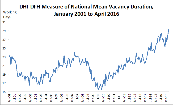
    Check the chart below from the latest DHI Group report, the DHI-DFH National Mean Vacancy Duration, which has been tracking average time to fill for about 15 years:

    The average job now takes 29.3 working days to fill, up from 27.7 in March, and represents an all-time high time to fill for the data series.

    Should you or we or anyone care about this? After all, time-to-fill as a singular recruiting metric is kind of flawed, and some would argue that it is not important at all at an individual job level. 

    But others (and I think I am one of them), that increasing time-to-fill duration means something, and in the aggregate, (across the entire organization or in a major job function or industry group), that it can tell you quite a bit about the effectiveness of recruiting strategies and technologies.

    Because for me, when thinking about the massive amounts of investments made in technologies that are designed (at least on paper), to make recruiting, (again, in the aggregate), more efficient and effective, this all-time high level for time to fill suggests that we are all contributing in some degree to a pretty massive fail. What other industry or major business process can you think of that has actually gotten less efficient, despite hundreds of millions of dollars of investment over more than two decades?

    Again, I know time-to-fill taken by itself and out of context might not be the best way to judge the health and success of technological investments for recruiting, but I think even the most cynical would have to at least admit that at a macro level that time-to-fill should not be increasing to all-time highs if organizations and their technology partners were actually functioning as designed or promised.

    Shouldn't recruiting be getting easier? Even just a little easier?

    I'd love to know what you think. 

    Am I off-base to even be thinking that time-to-fill really matters? Most organizations would happily trade a few days to fill in order to make the 'right' hire. But shouldn't technology and process have evolved to the point where making that tradeoff should happen less and less?

    This issue was on my mind way before this latest set of statistics has come out, and I am even putting together a general session at the upcoming HR Technology Conference in October to talk about it.

    Two decades, millions and millions of dollars spent, and yet at least by this measure, we are not getting any better at putting people in the right jobs.

    It's baffling to me.

    Wednesday
    Jun012016

    CHART OF THE DAY: We have all the apps we need

    Question time, then today's Chart of the Day...

    How many smartphone apps would you say you use regularly?

    10? 15? Maybe more?

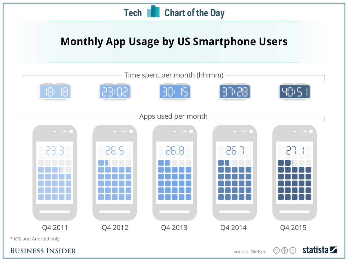
    Likely more, actually. According to some recent data from Statista the average US smartphone owner uses about 27 apps on a regular basis. 

    But here's the interesting thing - that number is hardly changed in the last three years. Let's look at the chart, then some FREE comments from me after that.

    Three quick takes...

    1. As you can see from the data, we aren't using many more apps than we did in 2012, but the monthly time spent on them has almost doubled since 2012. Which means fewer apps are breaking through the clutter and noise of the Apps stores, but the ones that do are commanding more and more attention and mind share.

    2. Getting user's attention with any new app is getting harder and harder by the month. Sure, we do sometimes swap out some older apps for some newer ones, but we seem to have no more room for an increase in the number of apps we can manage and use. So not only does any new app need to offer a compelling value proposition in its own right, it likely also has to 'replace' something in most user's minds, since we can't 'fit' more apps into our lives.

    3. If you are considering rolling out any new apps for your workforce, no matter how fantastic and functional they may seem, you are competing for precious and limited time and attention from your targeted users, and are also fighting a battle for phone screen real estate and attention not just against the web-based version of that HR system, but also all the personal apps your employees are using every day. And what the Statista data suggest is that collectively we are running out of app capacity in terms of what we can and would like to engage with on our phones.

    Do you need an app for your HR, recruiting, benefits or other HR tools?

    Maybe. Probably even.

    But will your users have the bandwidth and ability to adapt your fancy new app?

    Maybe not.

    Have a great Tuesday. 

    Monday
    May162016

    CHART OF THE DAY: More Americans are Working Longer

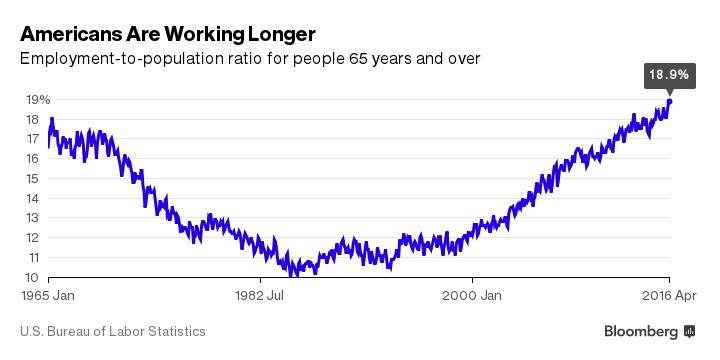
    I am a total mark for labor force data and today's Chart of the Day fits the bill perfectly. Check out the below chart on the Employment to Population ratio for Americans aged 65 and up over the last 50 years, and of course some FREE comments from me after the data

    (Chart courtesy of Bloomberg)

    Lots of interesting points we can tease out of this data, so let's go..

    1. Just under 19% of Americans age 65+ are currently in the workforce, according to the BLS. This is the highest percentage of working people in this age cohort since the early 1960s. 

    2. Why are folks in this age cohort working in greater numbers than before? The most commonly cited reason according to a recent study from Transamerica is that they need the income and benefits. The financial crisis, and the tech bubble that busted a few years before that, devastated many baby boomers' retirement savings accounts, and has forced them to work longer than they had originally planned.

    3. The next most commonly cited reason for 65+ folks to remain in the workforce is that, well, they like their jobs and want to remain a part of their organizations. You probably know, or maybe feel this way yourself, that traditional 'retirement' is not at all that appealing. From the same Transamerica survey, 36% of respondents indicated enjoying their work and wanting to stay involved in the workforce was a primary reason to delay or postpone traditional retirement.

    4. Finally, a couple of other trends are factoring in to help drive the employment ratio up for older workers. Some organizations need the experience and expertise of these workers, and would have a difficult time replacing them should they begin to retire in greater numbers. In certain, less exciting industries, these older workers remain essential to the organization, and are being incented to stay in the labor force. And one more thing - folks are just living longer and remaining more productive later in their careers than in the past.

    Add it all up and it seems that these trends suggest that more and more of the workforce will be comprised of older, 65+ workers. Business and HR leaders that want to take best advantage of this situation will make sure they are not ignoring older workers in their recruiting, are willing and able to make necessary adjustments and accommodations as needed, and are actively engaging their older workers in important projects and in mentoring their younger, less experienced workers.

    We are all getting older. It just seems like it is happening all at once.

    Have a great week!

    Tuesday
    Apr262016

    CHART OF THE DAY: Trends in Labor Force Participation

    It's been ages since I broke off a CHART OF THE DAY post and even longer since I talked about the Labor Force Participation Rate, so let's remedy both of these situations in one shot.

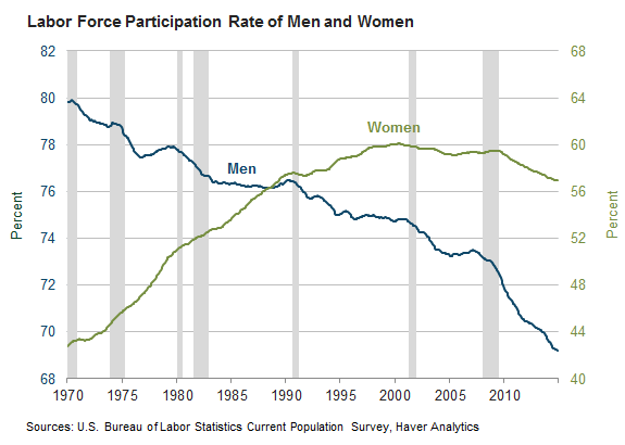
    Courtesy of your pals at the Federal Reserve Bank of Atlanta, have a look at a recently published chart on participation, this one broken down by gender. As always, some insightful comments from me after the data:

    Let's break down the data a little, and see if we might (Shock!) learn something. Some observations...

    1.  Male labor force participation has been on a long and steady decline for ages. In fact, males, as a group, have been less and less inclined to participate in the labor market since at least World War II.

    2. The female participation rate increased from about 43 percent in 1970 to a peak of 60 percent in the late 1990s, from which it has remained relatively flat over the last 15 - 20 years.

    3. But despite the economic recession of 2007 - 2008 ending, the data show that between 2010 and 2013, participation declined even more steeply for both men and women. Average female participation in 2014 was 57 percent—the lowest level since 1988—and male participation was down to a record low of 69 percent.

    What should we think about when considering this data? After all, participation is influenced by numerous factors like workforce age, prospects, disability rates, desire to continue schooling, etc.

    Let's look at what the Atlanta Fed thinks is the near-term direction for Labor Force Participation:

    "As a guide, the Bureau of Labor Statistics projects that the factors pulling down the labor force participation rate will outweigh those pushing it up, and that by 2022, labor force participation will be 61.6 percent, 1.4 points below its level at the end of 2014."

    The trends and the predicted continuation of these trends suggest a labor market that is even tighter than we are experiencing currently. It seems also likely that the kinds of jobs that will be hardest to fill are not the ones that will be easily filled by simply coaxing more people back into the labor force. 

    If anything, a declining participation rate makes even seemingly 'easy' to fill jobs that much harder to fill.

    Long story short, this data suggests that filling all kinds of jobs is just going to get tougher. It's probably a good time to be a recruiter though.

    A good recruiter I mean.