Quantcast
Subscribe!


Enter your email address:

Delivered by FeedBurner


E-mail Steve
This form does not yet contain any fields.

    free counters

    Twitter Feed

    Entries in data (149)

    Thursday
    May292014

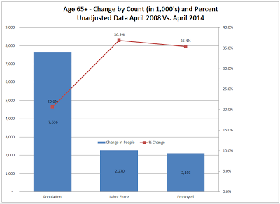
    CHART OF THE DAY: The U.S. Uninsured Rate

    With all the news and talk and debate about the ever evolving and complex set of requirements on organizations (and individuals) from the Affordable Care Act, it seems to me that one (fairly important) macro statistic often goes underreported, namely the percentage of people in the U.S. who still lack medical insurance.

    If you had to guess, (don't peek at the chart below), what would you guess the percentage of U.S. adults uninsured to be?

    It feels like it should be kind of high, right? Maybe 25% or 30%? 

    But you'd also guess that with the opening of the ACA exchanges late in 2013 and with all the news and attention surrounding getting folks to navigate the buggy Healthcare.gov website and actually getting them enrolled in Medical coverage, that the uninsured rate should be dropping I would bet.

    So what's the actual/estimated rate of uninsured adults in the U.S.? Check out the below chart from Gallup from their survey of 14,700 people in April 2014:

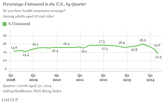
    So according to the Gallup survey, the uninsured rate among U.S. adults sits at 13.4% and does show a gradual decline since the launch of the ACA exchanges. When I first saw the chart and the 13.4% figure, I felt it was kind of low, I am not sure why. It just 'felt' like there would be more uninsured folks than that.

    The Gallup survey also breaks down this data into age/income groups, (click here for those details), but essentially they reflect what you'd expect - older, wealthier people are much less likely to be uninsured than younger and poorer people. But the trends in getting more people insured are improving across all age cohorts, which seems like a good thing.

    I suppose I don't have any big lesson/takeaway from all this, just thought it was interesting.

    Happy Thursday.

    Tuesday
    May202014

    CHART OF THE DAY: What age group has employment rising faster than population?

    Quick hit for a busy Tuesday - I wanted to share a chart (and the link to a few more interesting charts), on population growth, labor force growth, and employment growth between 2008 and 2014 for one specific category of workers - those aged 65 and up.

    First, here is the chart from Mish's Global Economic Trend Analysis, then some observations and free commentary:

    Apologies if the chart resolution isn't great, but hopefully you can still make out the key pieces of data. Essentially, while the population growth of those aged 65+ is really high (about 20% of an increase in this group since 2008), the rates of increase in labor force participation and employment are even higher (about 37% and 35% respectively).

    Additionally, this is the only age group where the labor force and overall employment rates are outpacing population growth. For example, 16-24 year olds have seen their ranks increase by about 4%, but employment for that group has declined about 6%.

    I know I have posted a few times about the general increase in age of the workforce, and the challenges and opportunities this presents to organizations, but it is probably worth thinking about perhaps more frequently than before. Older workers are often overlooked, and can present great sources of experience, insight, and even value, as any folks in this cohort do probably realize that they might be outside of their prime earning years. Also, many will be motivated by the opportunity to share their knowledge and give back as it were to their less experienced workers - which is exactly the kind of on the job learning and mentoring that the next generation desires.  Lastly, you probably don't have to be that concerned, (if at all), with ongoing development and career pathing with this group - they have likely ran most of their career journeys already.

    Anyway, this will have to be the last time I go on again about the aging workforce, I think the point has been beaten into submission. Unless I am still blogging say 20 years from now, where I will be screaming about the value of the older workers as far as I can still shout.

    Happy Tuesday.

    Wednesday
    May072014

    CHART OF THE DAY: Is College Still a Good Investment?

    There are and will continue to be just enough incredibly successful people who did not either attend college at all or did not earn a degree to raise at least some doubt in many parents and students minds regarding the 'Is it still worth it to attend college?' question.

    While there is no disputing the achievements of people like Steve Jobs, Bill Gates, maybe the guy who owns your local chain of car dealerships, who did not actually complete college, it seems these examples are more likely outliers, and that for most people/students, heading down (and completing) the path towards a college degree remains for the most part a sound personal economic strategy.

    Here's the chart. from the Federal Reserve of San Francisco, that I want to call your attention to that (Jobs and Gates aside), makes the 'college' case pretty strongly. It shows the earnings premium for college grads, and people with some college over people with just high school degrees.

    So the data is pretty clear, college has been and remains a pretty sound investment for most. 

    The research summary reads as follows:

    Earning a four-year college degree remains a worthwhile investment for the average student. Data from U.S. workers show that the benefits of college in terms of higher earnings far outweigh the costs of a degree, measured as tuition plus wages lost while attending school. The average college graduate paying annual tuition of about $20,000 can recoup the costs of schooling by age 40. After that, the difference between earnings continues such that the average college graduate earns over $800,000 more than the average high school graduate by retirement age.

    There are a couple of caveats here - one is that the researchers used about $20,000 as an estimate for annual costs of college - as most parents know this could be really, really low especially for private or 'prestige' schools. And the data is not terribly recent, tapping out in about 2011 or so, not taking into account the latest wave of teenage App Store millionaires.

    Sure college still probably isn't for everyone. But if you are a student or you are the parent of a student getting ready to face this decision you'd be wise to keep this research in mind. 

    Have a great day!

    Thursday
    May012014

    CHART OF THE DAY: Find your job on the When Will Robots Replace You Chart

    You know the robots are coming for all of our jobs, right?

    The question is not 'if' but 'when'. Sure, it will take some time, and I suppose there will always be some jobs that will, at least for the near term, always be the exclusive domain of humans, but lots of really smart people are predicting and anticipating a future where robots/automation do many of the jobs that people do today.

    In fact a recently published paper from researchers at the University of Oxford has attempted to quantify the amount of jobs that are likely or most susceptible to being eliminated and replaced with some kind of automation.  Check the chart below for a graphical look at the kinds or types of jobs that the researchers have concluded are the most likely to be automated away:


    The main finding that you can see in the chart data above: 47% of total US employment is at high risk of getting replaced by a robots, "meaning that associated occupations are potentially automatable over some unspecified number of years, perhaps a decade or two."

    So the takeaway, or advice for you, or more likely for your kids is you probably want to think about focusing your efforts on the kinds of jobs that skew more to the far left on the above chart. Finance, arts, science, engineering - these all seem like the types of vocations that at least in the near term are probably going to remain the domain of puny humans.

    And if you or someone you care about is working a job that falls more towards the right side of the chart - jobs like office and admin support, retail, or customer service/support, then you'd be well served to start figuring out how you can make some changes, and fast. 

    How long before the robots really come for these jobs?

    My guess it will take a little longer to actually start happening than most predictions suggest, but once it does start happening, the takeover will proceed much, much faster than we think.

    Happy Thursday.

    Tuesday
    Apr152014

    Is "In which month were you born?" a valid interview question?

    Quick 8 Man Rotation take for a busy Tuesday. Check out the chart below, a birth month distribution of about 240,000 professional soccer players taken from a database that tracks player signing and transfers and was compiled by David Bauer:

    Notice anything strange in the pattern distribution?

    How about the unusually high (relative) percentages of professional soccer players born in the first quarter of the year, particularly in January (11.3%), and the relatively lower percentages of players that were born at the end of the year (down to a low of 6.5% in December).

    It might not seem like that much of a disparity, but consider a similar chart that shows the birth month distribution of the entire population of the European Union, (below), and you can see some striking differences.

    As you can see from the total EU chart, people are born more or less consistently across the months of the year, with only small differences in percentages born in the highest percentage months.

    But professional soccer players? They show a striking and increased likelihood to be born in the first three months of the year.

    This phenomenon is attributed to the traditional soccer (and other sports as well) youth development process that groups players of the same age (Under 10, Under 16, etc.), for training and competitions.

    The theory then is that at those younger ages the physical size and skill differentials between an Under 10 year old player born in January and one born in December are really large, and noticeable. The player born in January then receives more attention, better coaching, more opportunities, etc., as he/she is simply deemed a better prospect than the player born in December. This then plays out again and again over time resulting in more of the 'early year' born players making it to the professional levels.

    No one knows if this is really true and explains the birth month disparity of professional soccer players compared to the overall population, but it does seem at least plausible.

    So circle this back to your HR/Talent shop. Does this kind of analysis make sense for you to consider? Is there a similar performance effect that can be seen in other types of occupations besides professional soccer based on birth month distribution? Are comparatively "older for their grade level" people likely to turn out to be better at more than just playing sports? Do you care about the birth month of a candidate or an employee?

    I don't know. I guess it seems unlikely. But even so there is still a takeaway from this data which is this: If you want little Junior to grow up to be a pro soccer player, you may want to plan around a January birth date, (if it isn't too late).

    Have a great Tuesday.